Previous Month | RSS/XML | Current
WEBLOG
June 14th, 2026 (Permalink)
The Long, Hot European Summer
Here are two headlines from about a year apart:
Heat claims more than 175,000 lives annually in Europe, latest data shows1
Over 62,700 Deaths Associated with Record-breaking Heat During the Summer of 2024 in Europe2
The UN's 2024 estimate of the annual death toll due to heat, reported in the first headline above, is nearly three times what was reported the next year by the Barcelona Institute for Global Health (ISGlobal) for 2024, according to the second headline. What accounts for this discrepancy?
ISGlobal reported exactly 62,775 deaths for the summer of that year in Europe3. Interestingly, ISGlobal previously reported 61,672 heat-related deaths in 20224 and 47,690 in 20235, so its numbers have been consistently much lower than the UN's estimate of annual deaths. In addition, the fact that these numbers are not rounded off suggests that they are an attempt to count the deaths rather than just estimate them.
As I pointed out last month6, to count something you first have to define it. There are at least two concepts that need defining before we can count the heat deaths in Europe in 2024: "Europe" and when a death is attributable to heat.
In these reports you'll find references to "heat-related causes", "heat-related deaths", "heat-related mortality", "heat-related complications"7, as well as "heat stress" and "heat shocks"1. What counts as a heat-related fatality? For instance, would drowning count as a death from heat? I mention drowning only because recent news reports on the current "heat wave" in Europe discuss cases of drowning as "potentially heat-related deaths"8. It's not entirely implausible: when it gets very hot, people seek physical relief, and one way they do so is by swimming. Thus, the number of drowning deaths may increase during unusually hot weather. However, it's summer and people swim in the summer even when it's not unusually hot; would all drowning deaths during a heat wave be counted as heat-related or only excess deaths, that is, those exceeding the average number of drownings?
As a result of the vagueness of "heat-related death", there will be a lot of room for different counts. If the researcher is most worried about missing such deaths, a broad definition of "heat-related" will be used, and borderline cases will be classified as heat-related in order to avoid under-counting. In contrast, if the researcher is most worried about over-counting, a narrow definition will be used and unclear cases will be excluded. How much of the difference between the UN estimate and the ISGlobal counts is due to different definitions of "heat-related death"? Also, the precise counts down to the units column given for the past few years by ISGlobal are inevitably misleading. There's no way that such a fuzzy concept can be counted with that kind of precision.
In contrast to the imprecision of deaths due to heat, "Europe" appears to be a precise concept. However, if you delve into the UN report below the headline, you'll discover that it is estimating deaths in what it calls "the European region". Is the "European region" the same as what ISGlobal calls "Europe"? According to the UN, the "European region" includes 53 countries9, whereas ISGlobal states that its data covers 32 countries10. Presumably, the nations of Europe are a proper subset of those in the "European region". How much of the difference between the UN and ISGlobal counts is due to the difference between Europe and the European region?
I don't know the answer to these questions, and I don't raise them to answer them―I'm a logician, not a public health expert. These are questions that the editors who wrote the above headlines, and the reporters who wrote the stories beneath them, didn't even ask let alone answer, which is sadly typical of so much science reporting. As a result, we readers get headlines that clearly contradict one other, yet there's no way to tell which is right. Probably both are wrong, but how wrong?
According to the National Weather Service, 2024 saw a total of only 529 "heat-related fatalities" in the United States of America11! Given that the population of Europe12 is less than twice that of the U.S.13, what can account for an over hundred-fold difference in heat-related fatalities in the same year?
Excluding Alaska―I doubt very many Alaskans die from the heat―almost all of the U.S. is between 25 and 50 degrees North latitude14, whereas Europe is between 35 and 70 degrees North15. So, everything else being even, one would expect the latter to be colder and thus to have fewer fatalities due to heat―but everything else is seldom even.
According to an article in Slate, Europe has far less air conditioning than the U.S.16 Specifically, only 10% of European households have air-conditioners as opposed to 90% of those in the U.S.17 How much of the two orders-of-magnitude difference in heat deaths is accounted for by this difference in air conditioning?
Despite these facts, you might not know that air conditioning even exists if you rely on news stories about the European heat waves. For instance, in a report about the UN estimate18, the words "air conditioning" and "air conditioner" do not occur, even though both blinds and shutters are mentioned as ways to mitigate the heat. If you were an alien basing what you know about Earth on these reports, you'd think that Earthlings lack the technology to cool their dwellings.
According to recent news reports19, this summer in Europe is threatening to be another hot one and people are already dying. If the above statistics are to be believed, we should expect total deaths in the tens of thousands. Many, probably most, of these deaths will be of the elderly, who are more susceptible to the ill effects of high heat than young people20. Even if we take the lowest estimates of deaths due to heat in Europe in recent years, the numbers are shocking, especially in comparison with those for the U.S. If even a fraction of the lowest estimates could be avoided by air conditioning, shouldn't Europe start a crash program to air condition the continent before next summer kills tens of thousands more elderly Europeans?
Notes:
- ↑ "Heat claims more than 175,000 lives annually in Europe, latest data shows", UN News, 8/2/2024.
- ↑ "Over 62,700 Deaths Associated with Record-breaking Heat During the Summer of 2024 in Europe", Barcelona Institute for Global Health (ISGlobal), 9/22/2025.
- ↑ Given that most heat-related deaths happen in the summer, the difference between the number for the summer and that for the whole year cannot account for the entire discrepancy with the UN's estimate, though it might account for a small amount of it.
- ↑ "Record-breaking Heat in the Summer of 2022 Caused more than 61,000 Deaths in Europe", ISGlobal, 7/10/2023.
- ↑ "Heat Caused Over 47,000 Deaths in Europe in 2023, the Second Highest Burden of the Last Decade", ISGlobal, 8/12/2024.
- ↑ Doing Violence to the Data, 5/2/2026.
- ↑ Alison Withers, "Europe had over 62,700 heat-related deaths in 2024, report finds", Reuters, 9/22/2025.
- ↑ For instance: Matthew Cappucci & Daniel Wu, "A deadly heat wave hits Europe, with decades-old temperature records falling", The Washington Post, 5/27/2026.
- ↑ "2025 AMWHO Regional Guide (Euro)", 2025 AMWHO International Conference.
- ↑ Janoš, T., Quijal-Zamorano, M., Shartova, N. et al., "Heat-related mortality in Europe during 2024 and health emergency forecasting to reduce preventable deaths", Nature Medicine 31, 4065-4074 (2025).
- ↑ "2024 Heat Related Fatalities", National Weather Service, 3/24/2026.
- ↑ "What is the current population of Europe?", Wolfram Alpha, accessed: 6/12/2026.
- ↑ "What is the current population of the United States of America?", Wolfram Alpha, accessed: 6/12/2026.
- ↑ Rand McNally World Atlas (1988), p. 33.
- ↑ Ibid., p. 3.
- ↑ Henry Grabar, "Paris Is Burning. So Why Won't Europeans Install A/C?", Slate, 8/10/2022.
- ↑ Another estimate has it at 20%; see the article under note 8, above.
- ↑ Lottie Limb, "'Ultimate price': 175,000 Europeans die heat-related deaths a year, WHO warns", EuroNews, 1/8/2024.
- ↑ Jill Lawless, "Exceptionally early heat wave shatters records and brings deaths in Europe", Associated Press, 5/26/2026.
- ↑ Stephanie Dutchen, "The Effects of Heat on Older Adults", Harvard Medicine, Autumn 2021.
June 4th, 2026 (Permalink)
How to Solve Logic Puzzles with Euler Diagrams
In a couple of previous entries, I explained how to use Venn diagrams to solve certain types of logic puzzle1. In this one, I'll show how you can do so with Euler diagrams instead. I've previously explained the difference between these two types of diagram, so I won't do so again2. Let's begin with an easy example; try to solve the following puzzle with any method you please, or none at all. Here are the clues:
- Anyone's aunt is somebody's sister.
- Ants are six-legged insects.
- Nobody's sister has six legs.
Based on these three clues, what can you conclude about the relation between ants and aunts?
There are four classes mentioned in the three clues: aunts, sisters, ants, and insects. There could be a fifth class, namely, six-legged animals, but since all insects have six legs and almost all animals that have six legs are insects, let's treat insect and six-legged as the same class. Moreover, as we shall see, the clues are either A-type or E-type categorical statements. So, this puzzle is a good candidate for an Euler instead of a Venn diagram, since Venn diagrams for more than three classes are problematic, as are Euler diagrams of I-type or O-type categorical statements.
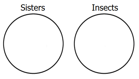
Let's start by representing the third premiss, which says that the classes of sisters and insects are disjoint, that is, it's E-type. To show this with an Euler diagram, we construct two non-overlapping circles, like so:
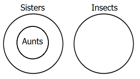
Next, represent the first premiss, which tells us that all aunts are sisters, which is A-type. To show this in the diagram, we place the circle representing aunts completely within the circle of sisters.
Finally, represent the second premiss, which says that all ants are insects―another A-type―by placing a circle for ants inside the insect circle.
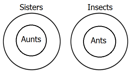
We're done diagramming! Now, we just need to look at the diagram and see what relation it shows between ants and aunts. Obviously, the diagram shows that the class of ants and the class of aunts are disjoint, in other words, no aunts are ants. I'm sure you already knew that, but it's to nice to see it proved.
The most difficult part of the puzzle was not the diagramming, but representing the clues as relations between classes. Here's a harder puzzle to practice your Euler diagramming skills on:
- Detective stories are a type of genre fiction.
- Literary snobs like only literary fiction.
- Poe's Dupin stories are the first real detective stories.
- Genre fiction is highly popular with most readers.
- Literary fiction is not popular.
Do literary snobs like Poe's stories about Dupin?
All of the clues are either A-type or E-type statements.
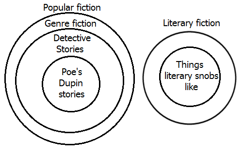
Here's an Euler diagram displaying the logical relations between the classes mentioned in the clues. As you can see, the diagram shows that literary snobs don't like Edgar Allan Poe's Dupin stories. That's why they're snobs!
Disclaimer: No sisters, aunts, ants, or other insects were harmed in the making of these puzzles, but some literary snobs may have had their feelings hurt. Sorry.
Notes:
- ↑ See: Using Venn Diagrams to Solve Puzzles, Part 1, 1/18/2017 & Part 2, 3/7/2017.
- ↑ See: Lesson in Logic 12: Two-Circle Venn Diagrams, 7/16/2016, Lesson in Logic 16: The Third Circle, 2/16/2017 & Lesson on Logic 21: Euler Diagrams, 8/20/2025.
May 31st, 2026 (Permalink)
Another Puzzle in Woodpecker Woods1
Woodpecker Woods (WW) is an ornithological nature preserve especially for woodpeckers. All but six of the woodpeckers in WW are Red-headed Woodpeckers. All but six of the woodpeckers in WW are Hairy Woodpeckers. All but six of the woodpeckers in WW are Red-bellied Woodpeckers.2 There are no other types of woodpecker in WW.
How many woodpeckers are there in WW?
Nine. There are three of each kind of woodpecker.
Notes:
- ↑ For a previous puzzle in WW, see: How to Solve a Problem: Divide and Conquer, 9/11/2023.
- ↑ These are three distinct species of woodpecker, so there is no overlap between the three types.
Disclaimer & Disclosure: This puzzle is a work of fiction. No woodpeckers were harmed in the making of this puzzle.
May 24th, 2026 (Corrected: 5/27/2026*) (Permalink)
How to Lie with Notes 7: The Zombie Citation
The previous entry in this series1 concerned the bizarre and troublesome spread of phantom references, that is, citations to works that do not actually exist. Zombie citations are different from phantom ones: the latter are citations to works that never were, whereas the former are references to works that once were, but are no more, that is, a zombie citation is to a scholarly work that has been retracted. Like a zombie, a retracted work once lived but has now died, and it wants to eat your brain.
Retraction is the most severe sanction a piece of scholarship can receive and is, consequently, uncommon. For instance, the vast majority of papers that report results that can't be replicated are not retracted; instead, retraction is usually reserved for works that are not just wrong, but involve scholarly misconduct. Among the more common or important reasons why a work may be retracted are: data manipulation or fabrication; plagiarism, including self-plagiarism, that is, publishing the same work multiple times in multiple places without informing the publishers of the duplication; and undisclosed conflicts of interest, such as accepting money from a firm or interest group that may benefit from the results, then failing to disclose such a payment to the publisher2.
Having a work retracted is by no means always shameful for a scholar, though there's not much doubt that it's embarrassing. However, some scholars have retracted their own work when they discovered significant errors in it, or others pointed out such errors3. This is, in fact, exactly what one should do and is part of the generate-and-test process by which science progresses. We all make mistakes and, while doing so is embarrassing, we learn by trial-and-error, so error is an unavoidable part of the advancement of knowledge.
Citing a since-retracted work needn't reflect badly on a scholar, but to the extent that the retracted work supported the scholar's own work, that support is undermined. However, citing works after they have been retracted, especially if the retracted work is supposed to support the work in which it is cited, is itself an embarrassing mistake. It is, of course, permissible to cite retracted works if their retracted status is noted in some way.
In recent years, both the number of retractions and the number of citations of retracted works, appear to be increasing4. The reasons for this rise are not clear, though it's partly the result of the rising number of publications. A factor in both is probably the "publish-or-perish" practice in academia, which leads to both a greater quantity of publications―and, thus, more retractions―and lower quality of published work―and, hence, more need for retractions. Publish-or-perish pressure increases publication, which increases retractions, which increases citations of retracted works.
What can be done to prevent a zombie citation apocalypse? Being aware that there is a problem is, of course, the first step to doing something about it. Given the causal sequence indicated above, a further step would be to reduce the pressure on scholars to publish rubbish. However, I'm not optimistic about any change to the publish-or-perish practice in the foreseeable future: it's been around as long as I can remember. It seems to be ingrained in academia that scholars must have a long list of publications that nobody reads in order to employable. In the meantime, the onus is on the scholar to check that cited works have not been retracted.
* ↑ Thanks to David McRobert for pointing out a typo that is now corrected.
Notes:
- ↑ For previous entries in this series, see:
- Introduction, 10/23/2025
- Latin Abbreviations, 11/15/2025
- Anatomy of a Citation, 12/6/2025
- Ghost Notes, 1/3/2026
- Death by Footnote, 2/9/2026
- The Phantom Reference Menace, 3/8/2026
- ↑ Clarinda Cerejo, "What are the most common reasons for retraction?", Editage, 10/16/2013
- ↑ Quan-Hoang Vuong, "Retractions: the good, the bad, and the ugly", Nature, 9/8/2020
- ↑ Shelby Bradford, "Rising Retraction Rates: A Symptom of a Strained System", The Scientist, 5/8/2026
May 13th, 2026 (Permalink)
The Not-So-Whole Truth
There are two types of lies: lies of commission and lies of omission. A lie of commission is what we usually think of when we think of a lie, namely, an intentional untruth. Such lies violate the requirement when testifying under oath of speaking "the truth…and only the truth". In contrast, a lie of omission is the failure to tell a truth when it is required, as in testimony, where it violates the further requirement to speak "the whole truth". In other words, lies by omission are what are called "half-truths". Now, most of us are not lying by omission when we hold our tongues about something, because we are neither under oath nor otherwise required to tell the full truth. Journalists, in contrast, have a duty not to report by half-truths. It's not the job of reporters to hide from their readers what's really happening, but to describe it accurately.1
Case in point, here's the first clause of the opening sentence of a recent NBC News report: "Kyle Rittenhouse, who gained fame for opening fire at a 2020 civil rights rally in Wisconsin….2" This makes it sound as though Rittenhouse just walked into a "civil rights rally" and opened fire. However, it was not a "rally" for civil rights, it was a riot. As I pointed out at the time, the word "riot" suddenly became a taboo four-letter word for the events in Kenosha, Wisconsin and other cities in 20203. Apparently, that is still true today, at least at NBC.
Here's how the article goes on to describe what happened: "Rittenhouse became a household name in late summer 2020 after he fatally shot two men and wounded a third during civil unrest in Kenosha, Wisconsin." "Civil unrest" is closer to the truth than "rally", but it's still a euphemism for "riot".
William Lutz listed "civil disorder" as doublespeak for "riot" as long ago as 19994. Google's Ngram viewer shows both "civil disorder" and "civil unrest" to be uncommon phrases in books prior to 1960, when the former shot up in that decade of riots, peaking in 1969, and then beginning a steep fall. At the same time, "civil unrest" began a slower climb, surpassing "civil disorder" in 1982, and continuing to rise until a peak in 2019. Of the two euphemistic phrases, "civil unrest" is the current champion by about six-fold5.
The NBC report continues with another euphemism: "The city had been rocked by protests over the police shooting of Jacob Blake two days earlier." Why was the city "rocked" by "protests"? Because these were the same "protests" that CNN infamously labelled "fiery but mostly peaceful"6, that is, they were riots. During these "mostly peaceful" protests over a hundred buildings were damaged and at least forty businesses destroyed7. Is arson and looting now considered a peaceful protest?
The report continues: "Rittenhouse, then a 17-year-old resident of Antioch, Illinois, went to Kenosha with an AR-15-style rifle…." This is the only outright falsehood in the article, since Rittenhouse did not take the rifle to Kenosha but got it from a friend while there8. Either NBC did not know this fact or lied about it; I prefer to believe the former, but it doesn't inspire confidence in NBC as a source of news that it didn't know the truth.
The report goes on: "He ended up killing Joseph Rosenbaum and Anthony Huber and wounding paramedic Gaige Grosskreutz during the melee." The report gives no information on how he "ended up" killing two men and wounding another; the phrase "ended up" makes it sound as if it just happened for no reason. There is no mention that all three were attacking Rittenhouse when shot9.
The report also gives the impression that Grosskreutz came to give first aid to the victims of a "melee" and was just shot by Rittenhouse―why else mention that he was a paramedic? There's no mention that Grosskreutz was armed with a handgun and was pointing it at Rittenhouse when shot10―that gun is never mentioned.
These facts might help explain the next sentence: "Rittenhouse, who testified in his own defense, claimed he was acting in self-defense before jurors acquitted him on all five charges connected to the shooting." By only telling half the story, NBC makes it sound as though the jury just believed Rittenhouse's claim and acquitted him, but there was evidence, including video and testimony, to support that claim.
That's all that this report has to say about what happened that night. Outside of one minor falsehood, what it says is the truth, but it's not the whole truth. If this article were presented as testimony in a trial, the author would be committing perjury by not telling the whole truth. That remedy is not available, but if NBC News wants to salvage any of its remaining reputation for honesty, it should retract this article.
Notes:
- ↑ Another New Four-Letter Word, 6/5/2020. Paragraphing suppressed.
- ↑ David K. Li, "Kyle Rittenhouse hospitalized following bite from venomous spider", NBC News, 5/7/2026. USA Today published a nearly identical report except for differences in exact wording, see: Fernando Cervantes Jr., "Kyle Rittenhouse lands in hospital after venomous spider bite", USA Today, 5/8/2026. In academia, this would be considered plagiarism. Both reports were initially published the same day, so I don't know who plagiarized whom.
- ↑ A New Four-Letter Word, 5/29/2020.
- ↑ William Lutz, Doublespeak Defined: Cut Through the Bull**** and Get the Point (1999), p. 62.
- ↑ "civil unrest,civil disorder", Google Books Ngram Viewer, accessed: 5/11/2026.
- ↑ Alexis Tereszcuk, "Fact Check: CNN DID Use The Chyron 'Fiery But Mostly Peaceful Protests After Police Shooting'", Lead Stories, 8/29/2020.
- ↑ Alexis McAdams, "Kenosha unrest damages more than 100 buildings, at least 40 destroyed, alliance says", ABC 7, 9/2/2020.
- ↑ Haven Orecchio-Egresitz, "Police arrested a 19-year-old man who bought Kyle Rittenhouse the gun he used to kill two protesters", Business Insider, 11/10/2020.
- ↑ It's hard to find an unbiased account of what happened that night in Kenosha, but the following one seems fairly thorough: Ewan Palmer, "The Kyle Rittenhouse Trial Story Explained", Newsweek, 11/11/2021.
- ↑ Michael Tarm, Scott Bauer & Amy Forliti, "Shooting victim says he was pointing his gun at Rittenhouse", Associated Press, 11/8/2021.
May 6th, 2026 (Permalink)
The Almost Right Word
…[T]he difference between the almost right word and the right word is really a large matter―'tis the difference between the lightning-bug and the lightning."1
Opening a book at random2, I found the following sentence: "That summer, in the hot cities where poor families lived in cellars and drank infested water, the children became sick in large numbers.3"
"To infest" is a verb used of pests, such as insects or rats, that occupy a place in large numbers, and it's derived from a Latin verb meaning to attack or harass4. The example sentence tells us that many children were sickened, presumably from drinking the water. What was the water in those hot cities infested with? Piranhas, perhaps? Some type of insect?
"To infect" is also a verb but comes from a different Latin verb than "to infest", one meaning to dye or stain, but also to poison or corrupt5. "Infested" and "infected" are easily confused because they differ in spelling by only one letter, and a hurried line editor might easily mistake one for the other. Moreover, unlike many of the other word pairs we've examined in these entries, "infest" and "infect" have closely-related meanings, so it's no wonder they are easily confused.
My guess is that the illness mentioned in the example sentence was the result of some waterborne disease caused by a microscopic organism such as a virus, bacterium, or parasite, rather than the macroscopic forms of life that infest places. Such water is more accurately called "infected" than "infested", and a child who drinks such water becomes infected with the disease rather than infested.
As usual, I checked the example sentence in a few free online spelling or grammar checkers. As I expected, none found any mistakes since both words are verbs and the sentence is grammatically correct.
These words are so similar in grammar and meaning that it's not possible to say definitely that "infested" was the wrong word to use in the sentence; rather, it's Twain's almost right word, but the right word is "infected".
Notes:
- ↑ Mark Twain, The Art of Authorship: Literary Reminiscences, Methods of Work, and Advice to Young Beginners (1890), edited by George Bainton, pp. 87f. Emphasis in the original. I commented on this quote here: Struck by "Lightening", 1/1/2026
- ↑ Exactly why I opened it at random has no bearing on this entry, though it was an interesting happenstance that I found the sentence while looking for something else.
- ↑ Howard Zinn, A People's History of the United States (2015), p. 245.
- ↑ Luiz Jacintho da Silva, "The Etymology of Infection and Infestation", The Pediatric Infectious Disease Journal 16(12):p 1188, December 1997.
- ↑ Ibid.

May 2nd, 2026 (Permalink)
Doing Violence to the Data
Batya Ungar-Sargon, "Debunking the Data That Claims to Show Most Political Violence Comes From the Right", 4/28/2026
The third assassination attempt on President Trump's life this weekend has reignited a debate between Left and Right about where political violence in America comes from. The Right points to the assassination attempts on the President, the murder of Charlie Kirk, the rise of Islamist terrorism, the rabid violence of the George Floyd riots, the elevation of political violence fan Hasan Piker to celebrity status in the Democratic Party, and the recent polling showing that the more liberal a person is, the more likely they are to support political violence.On the Left, people point to January 6 as well as data purporting to show that most political violence comes from the Right. … The problem is, the "data" that these outlets have been relying on is deeply flawed.
One of the major sources is the Prosecution Project…which analyzes felony criminal cases involving political violence and sorts them by ideology. … Yet if you pull up the data center yourself, you can see immediately that it is deeply flawed.
The data set doesn't include either of the previous two assassination attempts on President Trump's life, as far as I can tell; a search for the time frame and the names of the would-be assassins turns up zero hits. Nor does it include the assassination of Charlie Kirk. The data set is based on prosecutions, which might explain the absence of [the first would-be assassin of Trump], who died at Butler. But what explains the absence of Trump's other would-be assassin…? It's pretty easy to say that the violence is coming overwhelmingly from the Right if you overwhelmingly edit out any political violence from the Left.
The Prosecution Project's (tPP) data is inherently skewed by being based solely on violence that's prosecuted. Ungar-Sargon mentions that the lack of inclusion of the first assassination attempt on President Trump may be explained by the lack of prosecution of the assassin, who was shot and killed at the scene, but there are other reasons why some political violence doesn't get prosecuted.
The editing goes deep. During the summer of 2020, the George Floyd riots were in full swing. Political violence claimed the lives of dozens of Americans and caused $2 billion in property damage. Yet the data set from the Prosecution Project lists …just three incidents of left-wing violence during that time. Maybe you think that people murdered during political riots shouldn't count as victims of political violence. …
Well, it depends. There are three problems with data for violence committed during those riots: first, it's difficult to identify, arrest, and prosecute perpetrators of violence during riots even if the effort is made; second, in some cases the effort was not made1; finally, many of those who committed violence were simply criminals taking advantage of the chaos caused by the riots to commit crimes.
How is one to separate the politically-motivated violence from the opportunistic? One could, of course, simply categorize all acts of violence committed during such riots as political, but then acts of self-defense against rioters would be counted too.
In any case, the tPP's data is systematically biased because it's based on prosecutions and, at least, should not be the sole source of data for a study of politically-motivated violence.
I couldn't find a complete dataset for the CSIS [The Center for Strategic and International Studies] graphs2, yet in their methodology, they note some glaring absences. For starters, the information it cites is culled from data provided by the ADL [Anti-Defamation League], which "uses public records such as media reports and police filings to reach their numbers," and the Southern Poverty Law Center―the same organization that was just indicted for actually manufacturing the racist violence it was "chronicling." Needless to say, if you are relying on the media, wildly skewed to favor the Left, for your data set, it's not data; it's propaganda.Moreover, even when acknowledging that left-wing political violence is on the rise, CSIS admits it went out of its way to absolve the Left of even more violence. In a recent report, it excluded pro-Palestinian terrorism from the Left, reclassifying it as "ethnonationalist incidents rather than left-wing ones," despite the Palestinian cause becoming the most important litmus test for belonging on the Left these days. This is just a naked attempt to absolve the Left of a signature issue because that issue inspires violence and the people tallying up the crimes want the Left to win. …
This is far from an exhaustive list of the way the Left cooks the books when it comes to its tabulations of where political violence is coming from. … Suffice it to say, it's enough to make any honest broker truly suspicious of what they're seeing out there as "data."
As I've pointed out previously3, to count something you first have to define it. For instance, if you were going to take a census of all the bald men in Baltimore, you'd first have to define "bald"―and "Baltimore". So, if you had an incentive to minimize the number of bald men in Baltimore, you'd be tempted to define both "bald" and "Baltimore" in narrow ways. In addition, no matter how you define the two terms, there will be borderline cases that could reasonably be put into one bucket or the other. Given your incentive to minimize the number of bald men, you'll be tempted to put the borderline cases in the "not bald" bin.
Similarly, to count cases of political violence you have to define both "political" and "violence", and it's sometimes unclear whether a particular case was either politically-motivated or an act of violence, which leaves a lot of wiggle room for politically-motivated manipulation of the data.
Finally, even should one succeed in accurately counting cases of politically-motivated violence, separating them into "left" and "right" requires further definitions. As Ungar-Sargon explains, The Center for Strategic and International Studies (CSIS) classified anti-Israel political violence as "ethnonationalist incidents" rather than "left"4. This is fine but then it classifies the violence committed by Trump supporters during the Capitol riots as "right" despite being ethnonationalist5.
For these reasons, any attempts to count incidents of political violence so as to blame one side or to exonerate the other should be approached with great caution, and studies on politically-charged topics by "think tanks" should always be treated skeptically. There is a lot of advocacy research from organizations with carefully neutral names, such as "The Prosecution Project" and "The Center for Strategic and International Studies", that reveal nothing of their political biases. Such groups are often funded by wealthy foundations and others with political views and goals6. The money that such donors donate may not come with explicit strings attached, but it always comes with implicit ones: the think tanks know that if they displease their donors, the money will stop flowing.
Now, I'm not saying that such funding skewed the research done by CSIS or tPP; but I'm also not saying that it didn't. What I am saying is that there are good reasons to be skeptical of any studies put out by such organizations. After putting both thumbs on the scale, the CSIS report admits that left-wing political violence is both on the rise and exceeded that of right-wing violence last year7. So far, this year is continuing the trend.
Notes:
- ↑ For instance, according to The Grauniad, most of the charges against "protestors" during the riots were dropped, see: Tom Perkins, "Most charges against George Floyd protesters dropped, analysis shows", The Guardian, 4/17/2021.
- ↑ Red flag.
- ↑ For instance: "Charts & Graphs: The Case of the Missing Murders", 11/10/2022.
- ↑ Daniel Byman & Riley McCabe, "Appendix: What Is Excluded?", The Center for Strategic and International Studies (CSIS), 9/25/2025.
- ↑ Byman & McCabe, "Methodology and Codebook", CSIS, 9/2025. See under "Riots".
- ↑ See: "Our Donors", CSIS, accessed: 4/30/2026.
- ↑ Byman & McCabe, "Left-Wing Terrorism Incidents Are on the Rise", CSIS, 9/25/2025.
Disclosure: I don't agree with everything in this article, but I think it's worth reading as a whole. In the above selected excerpts, I have sometimes suppressed the paragraphing and always removed the names of would-be assassins: I don't need to know their names, but they're in the original if you must know.
April 19th, 2026 (Permalink)
Dead Men Don't Review Books
Here's a puzzle for you: what's wrong with the following passage?
In The Making of the President 1964 (New York, 1965), Theodore White came to the conclusion that quotations had been utilized unfairly against the Republican candidate. … Harvard economist and former ambassador to India John Kenneth Galbraith sharply dissented from White's…view. … But Margaret L. Coit, Pulitzer Prize-winning author of a biography of John C. Calhoun, who had reviewed the White book elsewhere, wrote the Times to take sharp exception to Galbraith's point of view.1
When I first read this, I did a double-take: didn't Calhoun die in the nineteenth century? How could he have reviewed a book not published until 1965? In fact, Calhoun died in 18502, so he had been dead for over a century before the book he was supposed to have reviewed was even published. Of course, I soon realized―as I'm sure you have, too―that the phrase "who had reviewed the White book elsewhere" was meant to refer back to Coit rather than to Calhoun.
The modifier following Calhoun's name is an adjective clause, that is, a clause that functions as an adjective3. In English, the usual way that we indicate the noun that an adjective clause modifies is to place the clause next to the noun. In prose, an adjective usually precedes the noun. For instance, the passage describes John Kenneth Galbraith as a "former ambassador", where "ambassador" is the noun and "former" is the adjective. In contrast, clauses that function as adjectives may either precede or follow the noun they modify. Moreover, unlike single adjectives, adjectival phrases are often set off from the noun and the rest of the sentence by commas or, less commonly, dashes. For example, later on the same page as the passage quoted above, there is the following sentence: "Victor Lasky, who had bombarded JFK with hostile quotes of all kinds in his book on the late President in 1963, appeared to have mixed feelings about quotemanship in 1965.4" Here, the noun is the proper name at the beginning, and the adjective clause is the long phrase that follows the noun and is set off from the rest of the sentence by commas. So much for grammar.
Since the adjective clause in the above passage follows directly after Calhoun's name and is set off by commas, it appears at first glance that it must be modifying "Calhoun". However, given that Calhoun died long before the reviewed book was written, historical knowledge together with common sense indicates that this was probably not what the author intended. Reading the above passage, the historically informed reader searches for another noun for the adjective clause to modify, and finds Coit's name back at the beginning of the sentence.
This sentence is an example of what is called a misplaced modifier5. Where should the adjective clause have been placed? There's more than one way to do it, but here's one possibility:
But the Pulitzer Prize-winning author of a biography of John C. Calhoun, Margaret L. Coit, who had reviewed the White book elsewhere, wrote the Times to take sharp exception to Galbraith's point of view.
It's important to note that the original sentence is not ungrammatical. Rather, the grammar of the sentence seems to say something that the author didn't intend. How do we know he didn't intend it? Because dead men don't review books.
Notes:
- ↑ Paul F. Boller, Jr., Quotemanship: The Use and Abuse of Quotations for Polemical and Other Purposes (1967), p. 402.
- ↑ Gerald M. Capers, "John C. Calhoun", Encyclopaedia Britannica, 3/27/2026.
- ↑ Robert J. Gula, Precision: A Reference Handbook for Writers (1980), p. 255.
- ↑ Loc. cit.
- ↑ Gula, op. cit., pp. 54-55.