
Previous Month | RSS/XML | Current | Next Month
WEBLOG
February 28th, 2021 (Permalink)
The Doublethinkers &
Why are COVID-19 Cases Plunging?
- Natan Sharansky & Gil Troy, "The Doublethinkers", Tablet Magazine, 2/11/2021
What Sharansky means by "doublethinker" is not what George Orwell, who created the term "doublethink", meant. Here's the most explicit explanation from the article:
As the Party Line you follow publicly becomes increasingly disconnected from what you believe or see or experience privately, your cynicism grows along with your mental agility―your skill in living and writing in two contradictory scripts at once. That's how you become a doublethinker. … This round-the-clock public charade defined the typical life of a loyal Soviet citizen. You knew to be politically correct in everyday life. You said and wrote and did everything you were supposed to do, while knowing it was all a lie. You only acknowledged the truth with your family and a very close circle of trusted friends.
In other words, the "doublethinker" is the person under totalitarianism who must live a double life, never expressing private beliefs in public. Sharansky goes on to describe how he ceased being a doublethinker:
Breaking the shackles is the hardest thing to do as a doublethinker. Once you do that, the released energy gives you a rush you've never experienced before. … As thrilling as it was to be released from prison after nine long years in 1986, leaving the prison of doublethink years earlier made me even more euphoric. …
Once I had done it, once I was no longer afraid, I realized what it was to be free. I could live in history, a real history, with ups and downs, fits and starts, not the bland, ever-changing history-like-putty dictated by the authorities. I could live with real people and enjoy real friendships, not the cautious, constricted conversations of winks and nods among fellow doublethinkers. Most important, I could live without that permanent self-censorship, that constant checking of what you are going to say to make sure it's not what you want to say. Only then do you realize what a burden you've been carrying, how exhausting it is to say the right thing, do the right thing, while always fighting the fear of being outed for an errant thought, a wrong reaction, an idiosyncratic impulse.
And that was why, during nine years in prison, when the KGB would try tempting me to restore my freedom and even my life by returning to the life I once had, it was easy to say "no." I knew what they wanted. They wanted to take me back to this open-caged prison of doublethink.
It was easy enough to remind myself and them who was really free and who is a scared doublethinker. All I had to do was tell some joke about the Soviet leader…. As I'd tell my interrogators a joke, I'd laugh. And, as normal Soviet doublethinkers themselves, they would want to laugh. But they couldn't, especially if two of them were there together. Laughter would end their careers.
So they'd covered up that temporary glint in their eyes with a tantrum. They'd pound the table, shouting, "How dare you?"
"Look," I�d say to them calmly, "you can't even smile when you want to smile. And you claim that I'm in prison and you're free?"
I did this to irritate them, because they spent so much time trying to irritate me. But, mainly, I was reminding myself that I was free, as long as I could laugh or cry in accordance with my own feelings.
Over the last three decades in freedom, I have noticed that―with apologies to Tolstoy―every dictatorship is oppressive in its own way, but the doublethinkers' mental gymnastics are all alike. The feeling of release from the fear and giddy relief when crossing the line from doublethink to democratic dissent is also universal across cultures. This understanding prompted the Town Square Test I use to distinguish between free societies and fear societies: Can you express your individual views loudly, in public, without fear of being punished legally, formally, in any way? If yes, you live in a free society; if not, you're in a fear society.
In the West today, the pressure to conform doesn't come from the totalitarian top―our political leaders are not Stalinist dictators.
Not yet.
Instead, it comes from the fanatics around us, in our neighborhoods, at school, at work, often using the prospect of Twitter-shaming to bully people into silence―or a fake, politically-correct compliance. Recent polls suggest that nearly two-thirds of Americans report self-censoring about politics at least occasionally, essentially becoming a nation of doublethinkers despite the magnificent constitutional protections for free thought and expression enshrined in the Bill of Rights.
To preserve our integrity and our souls, the quality of our political debate and the creativity so essential to our cultural life, we need a Twitter Test challenging bottom-up cultural totalitarianism that is spreading throughout free societies. That test asks: In the democratic society in which you live, can you express your individual views loudly, in public and in private, on social media and at rallies, without fear of being shamed, excommunicated, or cancelled? Ultimately, whether you will live as a democratic doublethinker doesn't depend on the authorities or on the corporations that run social media platforms: it depends on you. Each of us individually decides whether we want to submit to the crippling indignity of doublethink, or break the chains that keep us from expressing our own thoughts, and becoming whole.
I discovered the following article while still working on my own on the same topic―see the previous entry. This is the best article I've seen so far on the recent decline in COVID-19 cases, and what may be the cause of it. I thought about rewriting mine to refer to it, but decided to point you to it here instead. It's worth reading as a whole, though I don't agree with it completely. I've added a few brief comments below where I disagree or have something to add.
- Derek Thompson, "COVID-19 Cases Are Dropping Fast. Why?", The Atlantic, 2/17/2021
One month ago, the CDC published the results of more than 20 pandemic forecasting models. Most projected that COVID-19 cases would continue to grow through February, or at least plateau. Instead, COVID-19 is in retreat in America. New daily cases have plunged, and hospitalizations are down almost 50 percent in the past month. This is not an artifact of infrequent testing, since the share of regional daily tests that are coming back positive has declined even more than the number of cases. Some pandemic statistics are foggy, but the current decline of COVID-19 is crystal clear.
In addition to other reasons that I gave in the previous entry, this is a reason to doubt that lower levels of testing due to the big winter storm can explain much if any of the plunge. Unfortunately, Thompson is less skeptical about another possible explanation:
What's behind the change? …
1. Behavior: Maybe Americans finally got the hang of this mask and social-distancing thing.
Maybe, but I doubt that it has much to do with the decline for the reasons given in the previous entry, so I'll skip to the next explanation:
2. Seasonality: The coronavirus was perhaps destined to decline this time of year.
Behavior can't explain everything. Mask wearing, social distancing, and other virus-mitigating habits vary among states and countries. But COVID-19 is in retreat across North America and Europe. Since January 1, daily cases are down 70 percent in the United Kingdom, 50 percent in Canada, and 30 percent in Portugal.
This raises the possibility that SARS-CoV-2, the virus that causes COVID-19, is seasonal. … The notion of seasonality is both obvious and mysterious. We know that many respiratory viruses are less virulent in the summer, accelerate in the closing months of the calendar year, and then recede as the days grow longer after December. …
But seasonality isn't just "the air" or "the weather," because the coronavirus doesn't thrive in the air nor does it live inside the weather. It thrives and multiplies in our bodies, and people do different things with their body when the temperature changes. When the temperature drops, we trade the outdoors, where the virus can struggle to multiply, for the indoors, where we clump together on chairs and couches, making it easier for the virus to pass from one host to another. We close our windows and constrict circulation and ventilation, which give airborne viruses another advantage.
Natural adaptation to cold weather could also make us vulnerable to respiratory viruses such as SARS-CoV-2. Our blood pressure rises during the winter, and our vitamin D levels dip as the days shorten and the sun hangs at a lower angle in the sky. While feeling cold can't give you a cold, cold and dry air can indeed suppress the local immune response in our nasal passages, which makes us easier targets for, say, an airborne respiratory virus that binds with enzymes commonly found in our noses.
Still, February is pretty cold. In many parts of the country, it's been colder and drier than it was in late December, and unexpected places are experiencing a cold snap. So…saying the decline in cases was simply inevitable won't satisfy skeptics. Something else may be happening too.
As an explanation, seasonality shouldn't satisfy skeptics; it shouldn't satisfy anyone. At best, it's speculation. If the coronavirus is seasonal, then cases should rise or at least remain high through the winter months. Something else has to be happening because the explanations examined so far either don't explain the decline in cases or are just speculation. So, what other explanation is left?
3. Partial immunity: Is the virus running out of bodies?
The coronavirus needs bodies in order to survive and replicate, and it now has access to fewer welcome hosts. Fifteen to 30 percent of American adults have already been infected with COVID-19, according to CDC estimates. Since people recovering from COVID-19 typically develop lasting immunological protection for many months (at least), the number of antibodies swirling around the U.S. population may naturally constrict the original coronavirus's path forward. …
What I'm describing here is not herd immunity. Nothing is herd immunity, really.
Say what?
But it is partial immunity among the very populations that have been most likely to contract the disease, perhaps narrowing the path forward for the original SARS-CoV-2.
Throat-clearing about variants skipped.
4. Vaccines: The shots work.
COVID-19 cases started falling in January, when almost nobody outside of the health-care industry had been vaccinated. So vaccines probably don't help us understand why the plunge started. But they can tell us a bit more about why the decline in hospitalizations has accelerated―and why it's likely to continue. …
A bit of back-of-the-envelope math shows why this period of declining hospitalizations should keep going. Let's assume the CDC is correct that about 25 percent of adults have COVID-19 antibodies from a previous infection. Let's add to that number the 10 percent of adults who have received vaccine shots since December, assuming an overlap of 3 percent. That would mean one-third of adults currently have some sort of protection, either from a previous infection or from a vaccine. At our current vaccination pace, we're adding about 10 million people to this "protected" population every week. We're accelerating toward a moment, sometime this spring, when half of American adults should have some kind of coronavirus protection. And we should be particularly optimistic about severe illness among older Americans, since the vaccines are disproportionately going to people over 50, who have accounted for 70 percent of all hospitalizations.
That's a lot of messy arithmetic. But the upshot is simple: Even if the rise of new variants slows the decline in cases, it is unlikely to lead to a sharp rise in mortality and hospitalizations. Although the pandemic isn't over, we have perhaps reached the beginning of the end of COVID-19 as an exponential, existential, and mortal threat to our health-care system and our senior population.
Actually, it was never any of those three things to the American health-care system, though it was and will continue for awhile to be a mortal threat to vulnerable members of the population, that is, the old and already ill. Thankfully, the increasing level of acquired immunity in the population, combined with warmer weather in the spring and summer, means that there should continue to be declining numbers of cases and fatalities in the coming months.
The following excerpt is from an article by mathematician and former Soviet dissident Natan Sharansky describing what life is like under totalitarianism. It's long but very much worth reading as a whole.
February 24th, 2021 (Permalink)
Have you heard of herd immunity?
Journalism today is not just fixated on bad news, but it either ignores good news or works to spin it as bad. This makes it doubly difficult to actually find out what's happening if that's positive. In a recent opinion piece, Marty Makary, a professor of public health, wrote: "Amid the dire Covid warnings, one crucial fact has been largely ignored: Cases are down 77% over the past six weeks1". Is he right that this fact has been "largely ignored"?
Looking for articles reporting this decline in the news media, I found only a few. Just imagine what we'd see if there were a big rise in cases! What's more, the few articles that I found tended to try to downplay the good news. For instance, here's a recent headline:
US data shows a big decline in new Covid-19 cases.
Here's why it could be deceptive2
The article beneath the headline starts with the possibly "deceptive" good news:
The United States is seeing a large decline in new Covid-19 cases―but there's a major caveat. …[T]he US is seeing a 29% decline in new Covid-19 cases compared to this time last week, the steepest one-week decline the country has seen during the pandemic. …[I]n a White House briefing Friday, US Centers for Disease Control and Prevention Director Dr. Rochelle Walensky said the US continues to see a five-week decline, with the seven-day average of cases declining 69% since peaking on January 11.
So much for the good news; here's the "major caveat":
…[I]t's unclear exactly how much of the decline can be attributed to the winter weather that's gripped much of the country, forcing officials to close testing sites, which affects the collection of crucial data. Several states impacted by winter storms are seeing large declines in new cases this week, per Johns Hopkins data, including Texas, where cases are down 56% compared to last week. The COVID Tracking Project said Thursday it had been unable to update the daily number of tests performed in Texas for four days because of the winter weather. Overall, the US has seen nearly a 13.5% decrease in testing compared to this time last week.
This appears to be a reasonable concern but, as the article notes, it's not clear how much if any of the decline is due to a decrease in testing. The bad weather has definitely affected some states, such as Texas, but not every state―for instance, Hawaii and Alaska. Moreover, northern states, such as Maine or North Dakota, are used to winter weather and better prepared to deal with it than southern ones.
Let's look at the data for a few states not affected by the big storm: In Hawaii, the seven-day moving average peaked on the 12th of last month at 189 new cases and the 19th of this month has 39 cases, for a decline of 79%. Similarly, Alaska shows a 65% decrease from a local peak on the 8th of last month, Maine shows a decline of 78% from its peak on the 14th of last month, and North Dakota's decline from January 11th is 61%3. These declines are in line with the national one, so the caveat would appear to be minor.
Finally, the storm struck Texas a little over a week ago4, yet the "large decline" has been going on for about a month-and-a-half. If you look at the chart showing the national decline, there's no apparent change in the slope of the decline starting a week ago.
The article goes on to acknowledge that not all of the decline can be an artifact of decreased testing:
…[T]hat's not to say the United States hasn't made progress in driving down case numbers. Early this week, Dr. Ashish Jha, dean of the Brown University School of Public Health, and Dr. Jonathan Reiner, professor of medicine and surgery at George Washington University, both pointed to increased mask-wearing as one reason for declining numbers.
Has mask wearing increased in the last month or two and, if so, how much? There's no evidence given in the article itself that mask-wearing has increased. According to the only data that I've found, 70-94% of those surveyed throughout most of North America as of the first of the year said they always wore a mask when going out. The data shows a change since in only a few southern and midwestern states, where self-reported mask-wearing increased from 60-69% to 70-94%5. So, supposing that mask-wearing has increased a few percentage points in a few states recently, how much of the national decline could that account for? Just as with decreased testing due to the storm, it's hard to see how this could account for any substantial amount of the recent decline.
So, if not decreased testing or increased mask-wearing, what could explain the decline? The elephant in the room―in fact, a herd of them―is immunity. Makary asks:
Why is the number of cases plummeting much faster than experts predicted? In large part because natural immunity from prior infection is far more common than can be measured by testing. … Now add people getting vaccinated. As of this week, 15% of Americans have received the vaccine6, and the figure is rising fast.7
The CNN article I previously quoted does not even mention the possibility that immunity acquired from exposure to the virus coupled with vaccination may account for most of the recent decline in cases, but a different article from the same network does:
The US shattered its records for daily new infections, hospitalizations and deaths in early January after widespread holiday gatherings and travel. Since then, Covid-19 cases and hospitalizations have plummeted. Doctors say there are several reasons why: "One, we came off of really high numbers from the holidays," said Dr. Ashish Jha, dean of the Brown University School of Public Health. "Second, there is pretty good evidence that people are doing a better job of social distancing and mask wearing," he said. "Third, I think in a lot of communities, we've had so much infection that you have some level of population immunity. Not herd immunity, but enough population immunity that it is causing the virus to slow down."8
The first reason given is not a reason why cases have "plummeted": for all we knew then, the cases might have gone up even farther, hit a plateau, or declined slowly. Forecasts at the time the decline began predicted cases continuing to rise or, at best, hitting a plateau9. Other than the conclusion that epidemic forecasting, like election forecasting, is not ready for prime time, what does this failure to foresee the future tell us? Clearly, something is missing from our models of this disease. Could what's missing be acquired immunity?
I've already argued that such a large, sustained decline in cases is unlikely to be an artifact of increased mask-wearing or decreased testing. So, there's good reason to believe the decline is real and largely the result of immunity, whether acquired through exposure to the virus or to a vaccine. Based on his estimates of the amount of acquired immunity in the population, Makary claims: "At the current trajectory, I expect Covid will be mostly gone by April, allowing Americans to resume normal life." Maybe Makary is overly optimistic10, but our press is consistently overly pessimistic.
Makary continues:
Some medical experts privately agreed with my prediction that there may be very little Covid-19 by April but suggested that I not to [sic] talk publicly about herd immunity because people might become complacent and fail to take precautions or might decline the vaccine. But scientists shouldn't try to manipulate the public by hiding the truth. As we encourage everyone to get a vaccine, we also need to reopen schools and society to limit the damage of closures and prolonged isolation. Contingency planning for an open economy by April can deliver hope to those in despair and to those who have made large personal sacrifices.
I agree. Not only scientists, but also the press should not hide the truth from us, even for our own supposed good.
Update (3/8/2021): Now that COVID-19 cases have dropped so much from their record high in mid-January, there isn't much occasion for talk of "spikes" and "surges". Instead, the new buzzword seems to be "caveat", which we saw in the first article discussed above.
If any additional evidence is needed that many of those reporting this good news seem determined to find the dark cloud behind the silver lining, check out the following headline from The New York Times:
Covid-19: The U.S. Is Edging Toward Normal, Alarming Some Officials11
Some officials must be easily alarmed. The article includes the following sub-headline:
American life begins to return to normal, even as some fear it's too soon.
But some fear it may be too late; are we going to hear from them? If we're to make a rational judgment about when to return to normal life―whatever that means―we need to balance the dangers of doing so "too soon" against those of waiting too long. However, the article makes no mention of the latter danger, nor does it interview anyone who addresses it. So, as is all too common, we only hear the negative side.
The article concedes: "There are plenty of reasons for optimism: Vaccinations have increased significantly in recent weeks, and daily reports of new coronavirus cases have fallen across the United States from their January peaks." However, here come the "caveats", that is, the reasons for pessimism:
The positive signs come with caveats. Though the national statistics have improved drastically since January, they have plateaued in the last week or so, and the United States is still reporting more than 65,000 new cases a day on average―comparable to the peak of last summer's surge, according to a New York Times database. The country is still averaging about 2,000 deaths per day, though deaths are a lagging indicator because it can take weeks for patients to die.
If so, then we can expect a substantial decline in deaths over the next few weeks as this lagging indicator catches up with the decline in cases. In fact, the seven-day moving average of deaths has declined 49% since the peak in cases in mid-January to 1,706 deaths yesterday12. If the decline in deaths matches the decrease in cases, we can expect that number to fall to around 800 later this month. However, if there's any way to spin this news as negative, I'm sure they'll do so.
Update (4/1/2021): As of the last day of March, the seven-day moving average of deaths reported to the CDC is at 87913. As a result, the decline in the average number of daily deaths is currently 74% from its peak in mid-January―the sixteenth, to be precise―which is close to the decline in the number of daily cases since their peak around the same time.
Notes:
- Marty Makary, "We'll Have Herd Immunity by April", The Wall Street Journal, 2/18/2021. I don't know exactly what dates Makary used to figure the percentage decline, but I calculate a 69% decline in cases from the record number on the 12th of last month until the 17th of this month―the day before Makary's article was published―which is closer to five than six weeks. The data that I used came from the following source: "Trends in Number of COVID-19 Cases and Deaths in the US Reported to CDC, by State/Territory", Centers for Disease Control and Prevention, accessed: 2/23/2021.
- Dakin Andone & Madeline Holcombe, "US data shows a big decline in new Covid-19 cases. Here's why it could be deceptive", Cable News Network, 2/20/2021.
- All of the data in this paragraph comes from the charts available from the CDC source linked under note 1, above. It was calculated using the data available as of 2/19/2021. The states reported were not cherry-picked, but chosen for the reasons explained in the text, and no other states were checked.
- James Call, "Massive winter storm closes airports and delays vaccine deliveries to Florida", Austin American-Statesman, 2/15/2021.
- All of the data in this paragraph comes from the maps on the following page: "Maps of Mask Use", The Institute for Health Metrics and Evaluation, 1/20/2021, accessed: 2/21/2021.
- The following source claims that 13.3% of the American population have received at least one dose of a vaccine: Pien Huang & Audrey Carlsen, "How Is The COVID-19 Vaccination Campaign Going In Your State?", National Public Radio, 2/23/2021.
- See note 1 for the source. I think that Makary means "acquired" rather than "natural" immunity, since it is the former that comes from prior exposure to the virus, whereas natural immunity is that shared by all members of a species; see: Miquel Porta, A Dictionary of Epidemiology (5th edition, 2008), under "Immunity".
- Christina Maxouris & Holly Yan, "Here's why some Covid-19 numbers keep improving. (Hint: It's not widespread vaccinations)", Cable News Network, 2/20/2021. I don't know why Jha makes a distinction between population immunity and herd immunity, since the sources I've seen treat them as the same thing; see, for instance: "Coronavirus disease (COVID-19): Herd immunity, lockdowns and COVID-19", World Health Organization, 12/31/2020.
- See: Nicholas G. Reich, Estee Y. Cramer & Martha W. Zorn, "COVID-19 Forecast Hub weekly report", COVID-19 Forecast Hub, 1/12/2021. Compare the forecast chart from that page with the chart from the following one: "COVID-19 US Weekly Forecast Summary", COVID-19 Forecast Hub, 2/23/2021.
- Scott Gottlieb, from whom Makary gets some of his data, thinks so. See: Kevin Stankiewicz, "Dr. Scott Gottlieb says an estimate for 'herd immunity by April' too aggressive but directionally right", CNBC, 2/22/2021.
- "Covid-19: The U.S. Is Edging Toward Normal, Alarming Some Officials", The New York Times, 3/7/2021.
- See: "Trends in Number of COVID-19 Cases and Deaths in the US Reported to CDC, by State/Territory", Centers for Disease Control and Prevention, accessed: 3/8/2021.
- For the source, see the previous note. Disclaimer: This is not an April Fool's joke. I had to wait till the first of the month to get the data for the last day of March.

February 14th, 2021 (Permalink)
"Do you smoke after sex?"1
Reporting on science usually starts with a press release, and much of it also ends there. So, let's begin with a release put out by Stanford University School of Medicine's public relations office with the headline: "Regular marijuana use linked to more sex"2. Here's a headline that has much to capture the attention of reporters: sex and a drug that is still illegal in much of the country. Moreover, it suggests that chronic use of that drug somehow leads to more sex. However, as is typical of tabloid headlines, there's less to this story than meets the eye.
Notice the word "link" in the headline: this is one of several words that are used when a study does not show a causal relationship between two variables―in this case, marijuana use and sex―but only a statistical relationship. Another such word is "correlation", which occurs in the first sentence of the press release beneath the title: "The first study to examine the relationship between marijuana use and frequency of sexual intercourse at the population level in the United States shows a positive correlation between the two.3" Yet another is "association", which occurs in a boxed statement beside the article: "Stanford researchers analyzed data and found a positive association between frequency of marijuana use and frequency of sexual intercourse.3"
A "link", "association", or "correlation" between two variables does not necessarily mean that one causes the other. For instance, a traditional example is that penmanship is positively correlated with shoe size in children, that is, as shoe size increases, handwriting improves. Of course, wearing larger shoes does not cause better penmanship. Instead, there is a third variable―namely, age―that affects both shoe size and penmanship. As a child ages and grows, shoe size increases and handwriting tends to improve. This is why the press release states:
The study does not establish a causal connection between marijuana use and sexual activity, Eisenberg noted. But the results hint at it, he added.2
Here's another type of word you should watch out for in news reports of scientific studies: "hint". More commonly, one sees "suggests" or "suggestion"4. Is a suggestion stronger or weaker than a hint? I guess that a hint is weaker than a suggestion. In any case, "hints" and "suggestions" indicate that the study is at best weak evidence for a causal connection. Usually, such hints only suggest the need for further research.
Another limitation of this study is revealed in the press release's description of how it was done:
To arrive at an accurate determination of marijuana's effect on intercourse frequency, Eisenberg and Sun turned to the National Survey of Family Growth…. It explicitly queries respondents on how many times they've had intercourse with a member of the opposite sex in the past four weeks, and how frequently they've smoked marijuana over the past 12 months. … They assessed these individuals' self-reported patterns of marijuana use over the previous year and their self-reported frequency of heterosexual intercourse over the previous four weeks.3
In other words, the link, correlation, and association were not between sex and marijuana use, but between self-reported sex and self-reported marijuana use. What reason do we have to believe that either of these activities are self-reported accurately? And how is such self-reported data supposed to lead to "an accurate determination of marijuana's effect on intercourse frequency"? Even if the data is accurate, such a study cannot, by its own admission, show the "effect" of marijuana on sex.
The next step in the reporting process is for the reporter to rewrite the press release, though some do more cutting and pasting than rewriting5. Though simply copying a press release and presenting it as news is lazy reporting, at least it doesn't introduce new errors, which rewriting sometimes does. For instance, can you see what's wrong with the following passage from one such rewritten release?
"…[P]ot users are having about 20 percent more sex than pot abstainers," said the study's senior author, Dr. Michael Eisenberg, assistant professor of urology at Stanford. Given that the average couple has sex about once a week, Eisenberg said, the bottom line for partaking…could add up to 20 more instances of sexual intercourse each year. "I think if you asked a man or a woman, 20 more times to have sex over a year, that would seem like a lot," Eisenberg said.6
There's an inconsistent triad of claims in this passage: first, the mythical "average couple7" has sex once a week; second, marijuana users have 20% more sex than abstainers; and, third, that would mean 20 more instances of sex in a year for the "average" couple. Given that there are 52 weeks in a year, 20% more a year is not 20 more times, but between ten and eleven more. Would that seem like a lot in a year? The last sentence in this passage does not appear in the press release, so I've no idea where the reporter got it. Did the reporter actually do some reporting in addition to rewriting the release? Did Eisenberg actually make the quoted claim, or did the reporter misquote him?
Then there's the following puzzling sentence: "It used to be thought that couples mostly smoked after sex, but Eisenberg said his findings show the opposite is true for 'all races, ages, education levels, income groups and religions, every health status, whether they were married or single and whether or not they had kids.'"6 Again, the press release says nothing about smoking after sex, though the quoted words occur in the following passage, the first two sentences of which I quoted above:
The study does not establish a causal connection between marijuana use and sexual activity, Eisenberg noted. But the results hint at it, he added. "The overall trend we saw applied to people of both sexes and all races, ages, education levels, income groups and religions, every health status, whether they were married or single and whether or not they had kids."2
What does that have to do with smoking after sex?
Unfortunately, the study discussed here is all too typical of current scientific research into health and medicine, and the news report is typical of our science journalism. Too many studies do not establish, or even test, for causation, but only for statistical relationships between variables of interest. Such studies may be of value in guiding future research, which they always call for8, but such research is seldom done.
Meanwhile, the "links", "associations", and "correlations" found by the studies are used to sell eyeballs to advertisers, publicize research institutions, and advance careers. The "news" generated is seldom of value to the lay reader, unless that reader mistakenly believes that the links are causal, despite all the warnings in the news release and subsequent reporting.
How much damage is done to the health, both physical and mental, of those who read these reports and take them seriously? How many will either start using marijuana, or increase their use, in order to improve their sex lives? I don't know, but someone should research these questions.
Notes:
- This is the set-up of an old joke with the punchline: "I don't know, I've never looked."
- Bruce Goldman, "Regular marijuana use linked to more sex", Stanford Medicine News Center, 10/27/2017.
- Ibid., emphasis added.
- See: Java Jive: A Refill, 11/6/2017.
- For an egregious example, see: Hina Zahid, "Regular Marijuana Use Linked to Increased Sex Frequency: Study", Medical Dialogues, 9/17/2020.
- Barbara Goldberg, "Sex and drugs: U.S. study links marijuana use to more intercourse", Reuters, 10/27/2017.
- There is no such thing as an average couple; "average" is an adjective that has to modify a quantifiable noun phrase. So, there are couples with an average income, ones with an average bank account, and ones that have an average amount of sex in a year, but none that are just plain average. See: "Average" Ambiguity: Update, 11/9/2002.
- See the conclusion section of the abstract for the study: Andrew J. Sun & Michael L Eisenberg, "Association Between Marijuana Use and Sexual Frequency in the United States: A Population-Based Study", National Library of Medicine, 11/2017.
Disclaimer: This content is provided for information purposes only and is not intended as medical advice or instruction. I am not a physician, and I don't even play one on TV.
February 6th, 2021 (Permalink)
For All the Marbles
You're walking down the carnival midway when you hear a voice call out: "Come try your luck!"
According to the sign over the booth, the voice is that of "Three-Card" Monty*, who continues: "Step right up and try your luck at this completely fair game of marbles!" You approach the booth and see, on a waist-high shelf between you and Monty, a large bowl containing marbles. Next to the bowl are two large opaque jars with tops such as might be used to hold cookies.
"In this bowl are one-hundred marbles," Monty says, "fifty are red and fifty are blue. In a few minutes, I am going to put all of these marbles into these two jars. You won't know which marbles are in which jar. Then, you will select one of the two jars. From the jar you select, you will reach in and pull out one marble. Which color do you prefer?"
Let's suppose that your favorite color is red. If it's blue, instead, just read the rest of this puzzle substituting "blue" for "red" and vice versa.
"Alright, then, you take red," Monty continues. "I will make you an even money bet that the marble you draw from the jar is blue. So, if you bet a dollar and draw a red marble, I'll pay you a dollar; but, if you draw a blue one, you'll give me a dollar.
"Now, that's a fair bet, ain't it? There are an equal number of red and blue marbles. There are two jars the marbles will be in, and you'll select one of those jars without seeing what's in it. So, your choice might just as well be random―in fact, you can flip a coin to choose the jar iffen you want to. Then, without being able to see what's in the jar, you'll reach in and pull out a marble. Fifty-fifty! An even chance!
"So, how much do you want to bet?"
Is this a fair bet? Should you accept it?
Extra Credit: If the odds aren't fifty-fifty, what are they?
Monty wants to win the bet.
Monty never said that he would put the same number of marbles in each jar.
Solution: Don't take the bet as it won't be fair. Monty never bets on anything unless the odds are in his favor.
The odds in this game could be even, depending on how Monty distributes the marbles. For instance, supposing that Monty put all the blue marbles in one jar and all the red ones in the other, then the probability of drawing a blue marble would be 50%. But Monty wants to win, so he distributes the marbles in such a way as to maximize his chance of coming out on top.
What Monty did was to put one blue marble in one jar, and the remaining ninety-nine marbles in the other jar. So, clearly, there's a 50% chance of your choosing the jar with the single blue marble, but the other jar is almost half blue marbles. Therefore, the probability of your selecting a blue marble, and Monty winning the bet, is greater than 50%.
Extra Credit Solution: Since Monty wants to win, he will put the marbles in the jars in the way described above. The probability that you will select the jar containing just one blue marble is 50%, or .5, and the probability that you select the other jar is the same. The other jar contains 49 blue marbles and 50 red ones, so the probability that you will select a blue marble from it is 49/99, or approximately .495. So, the probability that you will select the second jar and pull a blue marble from it is .5 × .495 = .2475. So, the total probability of your selecting a blue marble is .5 + .2475 = .7475. In other words, the odds are not fifty-fifty, but almost 75-25. Thus, Monty can expect to win three dollars for every dollar you win.
Acknowledgment and Disclaimer: This puzzle is based on one from William Poundstone's How Would You Move Mount Fuji? (2003), pp. 83-84 & 206-207. This puzzle is fictional. The characters portrayed do not represent any people, living or dead, except for you―you're living, aren't you? Monty, in contrast, is fictional, but you still shouldn't bet with him.
* In case you haven't previously met Monty: he's a trickster who always speaks the truth and nothing but the truth, but he doesn't always tell the whole truth. Moreover, he never uses sleight-of-hand; he uses sleight-of-mind, instead. For previous puzzles involving Monty, see:
- Three-Card Monty, 4/19/2018
- The Four Ace Puzzle, 6/24/2018
- A Valentine's Day Puzzle, 2/14/2019
- Three-Dice Monty, 3/12/2019
February 4th, 2021 (Permalink)
How to Check Quotes, Part 4: A Case Study
The really frightening thing about totalitarianism is not that it commits 'atrocities' but that it attacks the concept of objective truth….1
In Part 32, I mentioned that some people, mostly dead ones, are "quote magnets", that is, they seem to attract quote attributions in the way that magnets attract pieces of iron. One such magnet is George Orwell, who tends to attract quotes about politics, especially those involving truth, language, and propaganda. For example, consider the following excerpt from a rather lengthy review of a new book about Orwell:
For a while now…a quotation has been doing the rounds on social media: "The further a society drifts from the truth the more it will hate those that speak it." It is attributed to Orwell and typically comes with a picture of him. But…Orwell…had nothing to do with it. It is the type of thing he might have said, and similar types of thing could probably be found in his writings. But that particular thing he never said. Attributing it to him might be a straightforward mistake, or it might be a deliberate attempt to give the statement more clout by attaching it to an iconic author. Whatever the reason, we have the fine irony that a stirring statement about the truth is being falsely―perhaps deceitfully―attributed to Orwell so that the Orwell who is made to "tell" this truth about the truth is not in fact being truthful. Also, the seeming pro-truthers who push this misattributed quotation―who like it, retweet it, make a screensaver of it and, for all I know, wear it on a T-shirt―inadvertently (or not) put themselves on the side of the false.3
This is a rare case when we know the true author of the quote in question, namely, Selwyn Duke4, from an article as recent as twelve years ago. How did Duke's quote get attributed to Orwell? We won't know for sure unless whoever was the first person to misattribute it comes forward, but it may be an example of Ralph Keyes' "axiom" that "famous quotes need famous mouths"5. Duke is less well-known than Orwell―in fact, I'm afraid that I'd never heard of him before I began researching the quote―so attributing the quote correctly would have less of an impact than putting the words into the better-known mouth.
Also, in the article from which the quote was taken6, the paragraph preceding the one in which it occurs mentions Orwell: "…[T]hey have thrust us into what George Orwell called 'a time of universal deceit,' where 'telling the truth is a revolutionary act.'" So, it's possible that whoever first misattributed the quote saw the name "Orwell" and mistakenly thought the subsequent remark was his, or confused the quote attributed to Orwell with Duke's subsequent words.
An irony of this situation is that the quote Duke gives is also misattributed to Orwell7. The quote is usually given in full as: "In a time of universal deceit, telling the truth is a revolutionary act." This, of course, makes no sense, since in a time of universal deceit, no one tells the truth, otherwise it would not be "universal". Orwell was too smart to have made that mistake.
I mentioned in Part 3 that many online quote sites are untrustworthy since they often include misattributed or fake quotes, and a test of the trustworthiness of such a site is to see if it includes or excludes a misattributed quote such as these "Orwell" ones. For instance, GoodReads, which appears to be a particularly unreliable site, includes both of these misattributions8.
I'm sure that many of those who use these quotes think that they sound like what "Orwell" would have said, and it never occurs to them to do any checking to see whether they're genuine. In these cases, such carelessness about the truth may do little harm, but that won't always be the case.
By the way, if you want to quote Orwell, try the epigraph to this entry. It doesn't say the same thing as either of the bogus quotes discussed above, but it has the virtue of being genuine.
Notes:
- George Orwell, "As I Please", Tribune, 2/4/1944.
- How to Fact Check Quotes, Part 3: Rules of Thumb, 1/2/2021.
- Martin Tyrrell, "Two Legs Bad", Dublin Review of Books, 12/1/2020.
- Selwyn Duke, "George Orwell is stealing my work", American Thinker, 11/14/2016.
- Ralph Keyes, "Nice Guys Finish Seventh": False Phrases, Spurious Sayings, and Familiar Misquotations (1993), pp. 20-22.
- Selwyn Duke, "Stopping truth at the border: banning Michael Savage from Britain", Renew America, 5/6/2009.
- See: "In a Time of Universal Deceit―Telling the Truth Is a Revolutionary Act", Quote Investigator, 2/24/2013.
- See:
- "'The further a society drifts from the truth, the more it will hate those that speak it.'", GoodReads, accessed: 2/4/2021.
- "'During times of universal deceit, telling the truth becomes a revolutionary act.'", GoodReads, accessed: 2/4/2021.
February 2nd, 2021 (Permalink)
Charts & Graphs: Why, Oh Why?
Last year, the Kansas Department of Health and Environment (KDHE) exhibited the following chart1 during a press conference2:
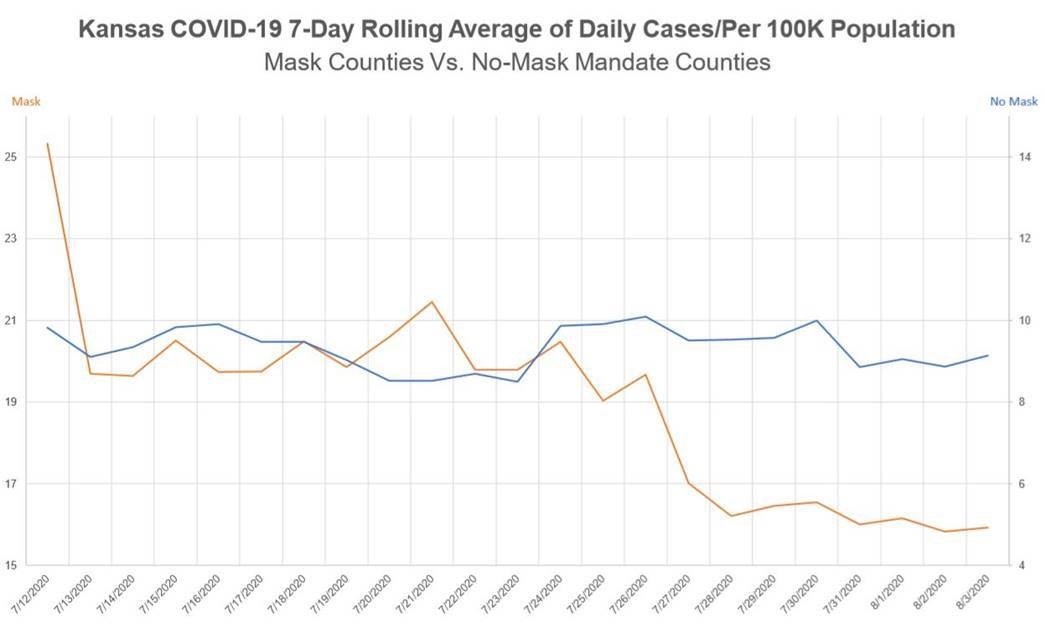
|
What does the chart show? The two lines represent week-long rolling averages of cases in two groups of Kansas counties: those with a mask-wearing mandate, represented by the orange line, and those without such a mandate, represented by the blue line. The chart seems to show the number of cases in mandate counties declining to less than the number in non-mandate ones. Does this mean that the mandate is working and should be extended to all counties?
Here's how a journalist reported the news conference:
Dr. [Lee] Norman showed the state of Kansas that masks do work by unveiling a graph at his news conference on August 5 of counties that did and did not adopt Governor Laura Kelly's July 3 mask mandate. He shows that those counties that chose not to follow Governor Kelly's mandate have not decreased in rates of positive COVID-19 cases while those that did have decreased. … The KDHE Secretary says he would like to see the rates of infection decrease before fall classes begin and he urges Kansans to wear masks….3
I'm unsurprised that the reporter interpreted the chart this way, as it is clearly the interpretation that Norman was pushing at the press conference, but not so fast. Let's take a closer look at the chart.
One thing that may escape a superficial examination of the graph is that this is a double-Y axis chart4, which means that there are two Y axes, one on the left side of the graph and one on the right. At the top of the left axis is the word "Mask" in orange, indicating that the left axis represents the mandate counties. Similarly, at the top of the right axis are the words "No Mask", meaning that the right axis represents the counties without a mandate.
A close examination of the chart's dual axes shows that the "Mask" one begins at 15 cases per 100,000 and extends to 25, whereas the "No Mask" one begins at 4 cases and extends to only 14. It's these dueling axes that lead the two lines to look like crossed swords. When the two lines are graphed on the same scale they do not overlap, as can be seen in the following graph5:
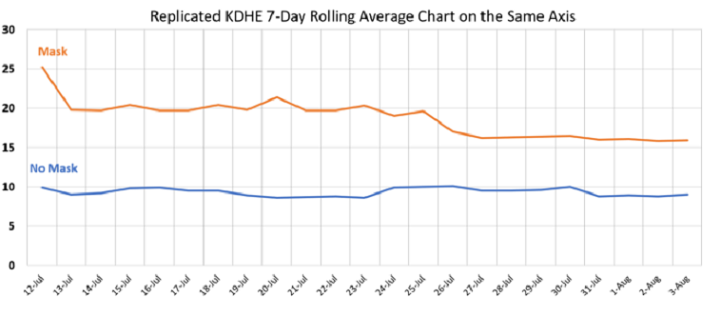
As you can see, the counties without a mask mandate consistently had fewer cases during this time period than those with the mandate. However, this doesn't mean that the mask mandate actually led to more cases, because the counties that adopted the mandate differed from those that did not. In particular, the mandate counties tend to be urban with high population densities, whereas the mandate-less ones are rural and low density, so it's an apples-to-oranges comparison.
Why was a YY chart used to present this data? Apparently, the KDHE wanted to emphasize the fact that the number of cases had declined in the counties with the mandate, whereas the case line for the mandate-less counties stayed relatively flat. This was not a bad use for a YY chart, since the two scales are comparable―that is, both cover ten points―so that the slopes of the two lines are on the same scale. However, YY charts are unusual and easily misinterpreted, especially by those unfamiliar with this type of graph. Moreover, to avoid misreading it, one must attend carefully to the two scales. For this reason, the chart should not have been shown in a press conference without a lot of warnings against misinterpreting it.
That said, there's an additional and even worse problem with the chart. Compare the single-axis chart, above, to the following one6:
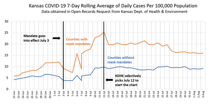
Instead of starting the original graph on the date the mask mandates went into effect, the date chosen was the day with the highest rolling average of cases for the mandate counties. Thus, the chart was bound to show a declining average for those counties over the following weeks.
Why did the KDHE choose to start the chart where it did? The reason given during the press conference was to take into account the incubation period of the disease7, since even if mask mandates are effective, one would not expect the effect to show up immediately. Instead, it would take some days at least for a mandate to result in a lowering of the number of cases. So, this is a reasonable basis for starting the chart a few days after the mandate was introduced, but why the particular date chosen?
According to the World Health Organization: "On average it takes 5-6 days from when someone is infected with the virus for symptoms to show, however it can take up to 14 days.8" This is a fairly broad range, and the date chosen for starting the chart is within it, but the average of 5-6 days would start the chart at July 8th-9th, when the number of cases was still rising sharply. I can't see any good reason why the 12th was selected as the starting point of the graph except that doing so would support Norman's talking point that the Governor's mask mandate was working.
Looking at the full chart, there is a slight decline in cases for a few days after the mandate is imposed, then a significant rise takes place until it hits the record on the 12th. The decline is too early to attribute to the mandate, and the rise is obviously not due to it since there is a corresponding if slightly smaller rise in the number of cases in the non-mandate counties.
Putting aside the original misleading chart, what can we learn from this data about the experience of Kansas with mask mandates? Sadly, nothing. The two types of county are simply too different to draw any conclusions about the effectiveness of mask mandates.
Notes:
- "Kansas COVID-19 7-Day Rolling Average of Daily Cases/Per 100K Population", Kansas Department of Health and Environment, accessed: 2/1/2021.
- "Live: KDHE COVID-19 Update", 41 Action News―KSHB-TV, 8/5/2020.
- Sarah Motter: "Dr. Lee Norman shows that masks work", WIBW, 8/5/2020.
- See: Charts & Graphs: The YY Graph, 11/19/2013.
- I found the chart here: Dave Trabert, "KDHE doctored a COVID case chart to justify mask mandates", The Sentinel, 8/7/2020.
- I found the chart here: Kevin Roche, "More on the Kansas Mask Lies", Healthy Skeptic, 8/22/2020.
- See the link under note 2, above, starting at about 4:49.
- "Coronavirus: Symptoms", World Health Organization, accessed: 2/1/2021.
Previous Month | RSS/XML | Current | Next Month | Top of Page
