Previous Month | RSS/XML | Current | Next Month
May 28th, 2016 (Permalink)
The Fifth Puzzle of the Unmatched Socks (and Shoes)
Mr. Red, Mr. Green, and Mr. Red-Green went bowling one evening. As befitted their names, Mr. Red wore red shoes and socks, Mr. Green green shoes and socks, and Mr. Red-Green red and green two-tone shoes and socks (these guys aren't known for their fashion sense). None of the three men wore bowling shoes, so each had to rent a pair from the bowling alley. While renting the shoes, the three men remarked upon the fact that they all wore the same size shoe.
After the game was over and they had returned the rental shoes, one of the men looked down at the two-tone shoe he was wearing on his red-stockinged left foot and remarked: "I think I'm wearing the wrong shoe."
Indeed, the three had gotten their own shoes all mixed up. You see, all three of them are color-blind (it could happen!). Of course, the men wore their own socks with the rental shoes, so there was no mix up of the socks. However, each ended up with a pair of shoes that did not match each other, nor did any shoes match the sock on the same foot.
Can you help the men get their shoes on right? What shoes was each man wearing, that is, what color shoe was on each man's left and right foot?
Previous Puzzles of the Unmatched Socks: 1, 2, 3, 4
May 22nd, 2016 (Permalink)
Hillary Clinton's Scandalous Venn Diagram
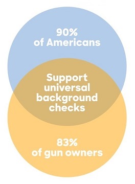
Hillary Clinton chirped or tittered or something and produced the "Venn diagram" you should see to the right. This is "the worst Venn diagram of all time" as a headline at Vox shouts, and "a data catastrophe" as well as "an atrocity in data visualization" as the following article claims. Come on, Vox, how about the worst of all possible Venn diagrams?
If you try to read this as a Venn diagram, a big problem is to figure out what the labels attach to. For instance, the middle, football-shaped overlap section seems to be labelled "Support universal background checks". However, if that's the case then the two crescent-shaped sections are labelled "90% of Americans" and "83% of gun owners", which would seem to indicate that only 10% of Americans and 17% of gun owners support universal background checks. Given what we know about Hillary Clinton's political position on such checks, this seems unlikely to be a message she would repeat. An alternative interpretation is that the "90% of Americans" and "83% of gun owners" labels attach to the two circles as wholes, so that the overlap area represents American gun owners, but then where did the remaining 10% of Americans and 17% of gun owners go to? Also, is Clinton really concerned about non-American gun owners' positions on background checks?
The conclusion is that this picture is not really a Venn diagram. In fact, it's not really a diagram at all: it's just a picture of two overlapping colored circles with some writing over them. Of course, it's supposed to look like, or suggest, a Venn diagram. You could say it's a Venn diagram for people who don't understand Venn diagrams, which may include Hillary Clinton.
That's about all that needs to be said about the diagram itself. Also, I don't want to jump on the Hillary Clinton bashing bandwagon; instead, I'd rather criticize the critics. If you're going to attack Clinton for not knowing what a Venn diagram is, then you really ought to know what it is yourself. For instance, here's Vox's explanation of what's wrong with Clinton's diagram:
But this is simply not how Venn diagrams work. The circles are completely wrong. They should, for one, overlap entirely, since the gun owners referenced in this are all Americans. And the circle for Americans should be much, much bigger than the circle for gun owners, since gun owners make up just one segment of the US population.
Then Vox suddenly realizes in the middle of the article that this does not describe a Venn diagram, adding:
As you can see, these aren't even Venn diagrams anymore; they're Euler diagrams. That's because a Venn diagram was the wrong choice for this data point in the first place. Maybe what Clinton wanted was a pie chart, bar chart, or Euler diagram, or maybe she didn't even need a chart―an infographic with the numbers splashed in big letters could have worked.
After starting off on the wrong foot, Vox eventually got it right: the alternative diagram that Vox describes is not a Venn diagram at all, but an Euler diagram. Moreover, the primary problem with Clinton's "diagram" is that a Venn diagram is the wrong type of diagram to convey the information, and even an Euler one is not much better. In fact, the information conveyed is simple enough that a diagram is neither necessary nor helpful.
Vox was not the only media outlet to be given the vapors by Hillary's faux pas. According to the author of a PJ Media article, this was "one of the stupidest tweets I have ever seen". Apparently, the author is new to Twitter. I don't even use Twitter and I've seen stupider "tweets". In fact, even the name "tweet" is stupid and it makes me feel stupid to have to use it.
All of this mocking of Clinton's apparent graphical illiteracy could have been avoided if she had just cited the figures. Notice that her message about guns is totally lost in all the accusations about her "horrible", "terrible", "godawful" diagram.
Sources:
- Dawn Chmielewski, "Hillary Clinton's horrible Venn diagram tweet has sparked a new meme", Recode, 5/20/2016
- German Lopez, "Hillary Clinton's campaign just released the worst Venn diagram of all time", Vox, 5/20/2016
- Katherine Mangu-Ward, "Hillary Clinton Just Tweeted This Godawful Venn Diagram About Gun Control", Hit & Run, 5/20/2016
- Tyler O'Neil, "6 Huge Problems With Hillary's Gun Control Venn Diagram", PJ Media, 5/20/2016
Resources:
- A. W. F. Edwards, Cogwheels of the Mind: The Story of Venn Diagrams (2004). Everything you want to know about Venn diagrams, and more!
- Sun-Joo Shin, Oliver Lemon & John Mumma, "Venn Diagrams", Stanford Encyclopedia of Philosophy, 2013. An advanced historical discussion.
Update (7/1/2016): I just discovered that there is a precedent for Clinton's pseudo-Venn diagram from the "enhanced" version of President Obama's State of the Union (SOTU) address in 2013 (see Source 1, below). The SOTU was "enhanced" by a series of charts and graphs, including the one shown to the lower right. At the time, I simply pointed to NPR's excellent discussion of the graphical presentation (see Resource 1 and Source 3, below). The following month I used one of the other graphs from the enhanced address in the series of lessons on how to mislead with charts and graphs (see Resource 2, below). Pseudo-Venn diagrams don't fit into any of the categories of misleading charts that I have discussed, though now that we have two examples perhaps it's time to consider a new category.
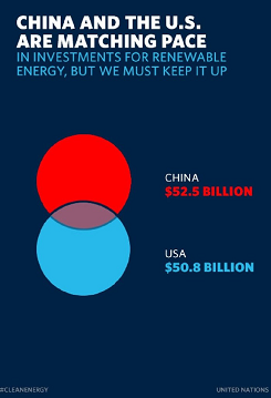
In its analysis, NPR wondered whether the picture was "a failed attempt at a Venn diagram", while Business Insider (BI) (see Source 2, below) insisted that "[i]t's certainly not a Venn Diagram." Both include what appears be a two-circle Venn diagram shown on its side, that is, with one circle stacked on top of the other, rather than showing the interlocking circles side-by-side as is customary. However, though the horizontal orientation is the custom, at least in logic books, there is no reason why Venn diagrams cannot be oriented vertically.
One difference between the SOTU diagram and Clinton's is the labels on the SOTU one are off to the side, whereas those on the Clinton diagram overlay the circles. Also, the area of overlap between the two circles is unlabelled in the SOTU diagram, but labelled in Clinton's. However, what the two diagrams have in common is that while both appear to be Venn diagrams, they each lack a coherent interpretation in terms of the labels provided. According to the labels of the SOTU diagram, the circles appear to represent the amount of money invested in renewable energy by China and the United States. However, if that's the case, then what does the overlap region of the circles represent?
The SOTU diagram is so similar to Clinton's later picture that I have to wonder if there is a connection between them. Is it possible that the same person produced both diagrams, or is there software that encourages the production of this type of diagram? Could mindless plugging of data into a diagramming program have produced these meaningless pictures?
Perhaps there is some interpretation of these diagrams that makes sense, but I'm not alone in my confusion: NPR refers to the SOTU chart as "silly", and BI's article calls it "useless" and "baffling". So, even if there is some way of making sense of them, both diagrams fail to communicate it.
Sources:
- "Enhanced State of the Union", The White House, 2/12/2013
- Walter Hickey, "This Is The Most Useless, Baffling Chart In Obama's State Of The Union", Business Insider, 2/12/2013
- NPR Staff, "Chart Check: Did Obama's Graphics 'Enhance' His Big Speech?", NPR, 2/14/2013
Resources:
- Charts & Graphs: The State of the Union, 2/28/2013
- Charts & Graphs: The Gee-Whiz Line Graph, 3/21/2013
May 13th, 2016 (Permalink)
Headline
If you thought this election year couldn't get more bizarre, there's this:
Donald Trump Denies He Impersonated Himself to a Reporter
Why would he need to deny that? Is it even possible to impersonate yourself? If you read the article attached to the headline, you discover that it wasn't himself that Trump was accused of impersonating. Rather, it has been claimed that twenty-five years ago Trump pretended to be a man by the name of John Miller who was acting as a spokesman for Trump. So, it's this John Miller that Trump was supposedly impersonating. Of course, that doesn't explain the headline―in The New York Times, even! Nor does it explain why this is considered a story. Surely the news media don't have to go back twenty-five years to find Trump acting like Trump.
Update (5/14/2016): Unsurprisingly, The Times has now revised its silly headline to:
Donald Trump Denies He Impersonated Spokesman to a Reporter
The original headline is still included in the URL of the story, in case you don't believe me.
May 11th, 2016 (Permalink)
Department of Doublespeak
"Euphemism inflation" is the linguistic phenomenon in which euphemisms wear out over time, losing their euphemistic force, and need replacement. The Department of Justice (DoJ) has recently announced some new euphemisms to add to the Doublespeak Dictionary. Here's Karol Mason, head of DoJ's Office of Justice Programs (OJP) in a guest post at The Washington Post―see the Sources, below, for the full article:
…[M]any of the formerly incarcerated men, women, and young people I talk with say that no punishment is harsher than being permanently branded a �felon� or �offender.� … The labels we affix to those who have served time can drain their sense of self-worth and perpetuate a cycle of crime….
"The labels we affix"? If you commit a rape, you are forever after a "rapist"; if you murder someone, you will be for the rest of your life a "murderer". Similarly, for terms such as "felon", "offender", and "convict". "We" do not affix these labels; rather, people affix these labels to themselves through the actions they take. If you don't want to be an offender for the rest of your life, don't offend.
Also, if it's true that "no punishment is harsher than being permanently branded a 'felon' or 'offender'", why don't we stop incarcerating people and just label them this way? I suspect that most offenders would prefer the label to incarceration unless it were a very short sentence. Furthermore, isn't the whole point of incarceration to punish people for committing crimes? If we take away the punishment of labeling someone as a "criminal", "convict", "offender", etc., should we increase incarceration time to make up for it?
Here is Mason's proposed solution to this supposed problem:
This new policy statement replaces unnecessarily disparaging labels with terms like �person who committed a crime� and �individual who was incarcerated,� decoupling past actions from the person being described and anticipating the contributions we expect them to make when they return. We will be using the new terminology in speeches, solicitations, website content, and social media posts, and I am hopeful that other agencies and organizations will consider doing the same.
Why is "offender" an "unnecessarily disparaging label" whereas �person who committed a crime� is not? Is "person who committed a crime" not disparaging, or is it just not "unnecessarily" so? If anything "offender" is a better euphemism since it is a general term that doesn't refer explicitly to "crime": an "offender" is anyone who offends, which means that Donald Trump is an "offender". Of course, the specific type of offense relevant to the DoJ is offense against the law, and "offender" in its legal sense is probably short for "criminal offender", but the unpleasant reference to crime has fallen away.
Anyway, it's just not true that these phrases "decoupl[e] past actions from the person being described". I gather that the idea is that by including the verb in the past tense―"individual who was incarcerated"―we emphasize that the individual is no longer in prison, and that the crime was committed in the past. But how is the person who committed the crime "decoupled" from the crime committed? We may say that a reformed person is "a new man", or "a different person", but this is not literally true.
By the way, "incarcerated" itself seems like the kind of euphemism that uses a long, unfamiliar word for a shorter one―in this case, "jailed" or "imprisoned". "Carcer" is the Latin word for "prison", so "incarcerate" literally means "imprison", but since "carcer" itself has not made it into English, the former has a less obvious meaning than the latter.
The OJP appears to be the department of the DoJ charged with getting the "individual who was incarcerated" back into society as a law-abiding citizen, thus reducing recidivism. No doubt this is a difficult task, and one can well imagine that the negative attitudes of employers towards offenders may make it hard for such a person to get a job, especially in a time of high unemployment. However, the OJP's approach to this problem seems to be to use doublespeak in an attempt to conceal the facts from potential employers. Unfortunately for the OJP, but fortunately for the cause of honesty in language, it's unlikely that many employers will be fooled by these clumsy attempts at obfuscation through prolixity.
The DOJ as a whole, in a recent press release and speech by the Attorney General, is promoting the use of another euphemism: "justice-involved youth"―for the speech and press release, see Sources 1 & 3, below. News articles discussing it have usually identified "justice-involved youth" as a euphemism for "juvenile delinquent"―for a typical example, see Source 4, below―but they fail to note that "juvenile delinquent" has all the earmarks of a euphemism itself. You seldom hear the words "juvenile" or "delinquent" nowadays, except when linked together in the phrase.
It appears that the adjectival "justice-involved" is the actual euphemism here, since it not only modifies "youth", but also "individual", and even "veteran" at the Department of Veterans Affairs―see Source 2, below―where we learn that:
A justice-involved Veteran is:
- A Veteran in contact with local law enforcement who can be appropriately diverted from arrest into mental health or substance abuse treatment;
- A Veteran in a local jail, either pre-trial or serving a sentence; or,
- A Veteran involved in adjudication or monitoring by a court
So, the relevant type of involvement in justice of the justice-involved youth, veteran, or individual is being on the wrong side of the law, alongside offenders, felons, convicts, and juvenile delinquents. These are all worn-out euphemisms that need to be replaced by newer, fresher, shinier, and more euphemistic ones. Unfortunately for the DoJ, �person who committed a crime� and �individual who was incarcerated" are doubleplusungood doublespeak.
Sources:
- "Attorney General Loretta E. Lynch Delivers Remarks at Second Chance Act―Justice and Mental Health Collaboration Program National Conference", The United States Department of Justice, 12/16/2015
- "Department of Veterans Affairs Programs for Justice-Involved Veterans", Veterans Justice Outreach Conference, 6/20/2011
- "The Departments of Justice and Housing and Urban Development to Award $1.75 Million to Help Justice-Involved Youth Find Jobs and Housing", The United States Department of Justice, 4/26/2016
- Josh Kenworthy, "Obama Wants You To Refer To Juvenile Delinquents As 'Justice-Involved Youth' Now", The Daily Caller, 11/5/2015
- Karol Mason, "Guest Post: Justice Dept. agency to alter its terminology for released convicts, to ease reentry", The Washington Post, 5/4/2016
Previous entries in the doublespeak dictionary: 2/24/2005, 7/2/2006, 7/17/2006, 3/25/2008, 9/25/2008, 3/17/2009, 3/29/2009, 9/16/2009, 9/24/2013
Solution to the Fifth Puzzle of the Unmatched Socks (and Shoes): Since the three men kept their socks on, we know that the man wearing a two-tone shoe over a red sock is Mr. Red. Because Mr. Red is wearing non-matching shoes that are not his own, he must be wearing a green shoe on his right foot. The left green shoe must be worn by Mr. Red-Green, since Mr. Green is not wearing his own shoes. So, on his right foot, Mr. Red-Green must be wearing the right red shoe. By a process of elimination, we can conclude that Mr. Green must be wearing the left red shoe and the right two-tone shoe. To sum up:
| Mister | Left Shoe | Right Shoe |
|---|---|---|
| Red | Two-Tone | Green |
| Green | Red | Two-Tone |
| Red-Green | Green | Red |
Source: Jaime & Lea Poniachik, Hard-to-Solve Brainteasers (1996). The puzzle is based on brainteaser 7, pp. 8 & 66.