
Previous Month | RSS/XML | Current | Next Month
WEBLOG
September 30th, 2023 (Permalink)
Magic Scarecrows & the Authoritarian Impulse
- John Tierney, "No Masks, Please, We’re Rational", City Journal, 8/15/2023.
Unfazed by data, scientific research, or common sense, the maskaholics are back. In response to an uptick in Covid cases, they’ve begun reinstating mask mandates. So far, it’s just a few places…but the mainstream media and their favorite “experts” are working hard to scare the rest of us into masking up yet again.
Never mind that at least 97 percent of Americans have Covid antibodies in their blood as a result of infection, vaccination, or both. Never mind that actual experts—the ones who studied the scientific literature before 2020 and drew up plans for a pandemic—advised against masking the public. Never mind that their advice has been further bolstered during the pandemic by randomized clinical trials and rigorous observational studies failing to find an effect of masks and mask mandates. Scientific evidence cannot overcome the maskaholics’ faith.
It’s tempting to compare them with the villagers in Cambodia who erected scarecrows in front of their huts to ward off the coronavirus—but that’s not fair to the villagers. Their Ting Mong, as the magic scarecrows are called, at least didn’t hurt any of their neighbors. The mask mandates imposed harms on the public that were well known before Covid, which was why occupational-safety regulations limited workers’ mask usage. Dozens of studies had demonstrated “Mask-Induced Exhaustion Syndrome,” whose symptoms include an increase of carbon dioxide in the blood, difficulty breathing, dizziness, drowsiness, headache, and diminished ability to concentrate and think. …
No drug with all these potential side effects would be recommended, much less mandated, for the entire population—and a drug that flunked its clinical trials wouldn’t even be submitted for approval. Yet the Centers for Disease Control, disdaining any cost-benefit analysis, continues to recommend masking for all Americans on indoor public transportation, and for everyone living in areas with high rates of Covid transmission. At the start of the pandemic, even Anthony Fauci advised against masks because there was no evidence of their efficacy. But then, in response to media hysteria, he and the CDC went on to recommend masks anyway, and justified themselves by citing cherry-picked data and consistently flawed studies.
Meanwhile, the CDC and its shills have continued to ignore or downplay the much stronger evidence against masks, most notably a review of randomized clinical trials published in January by Cochrane, the preeminent authority for evaluating medical evidence. The Cochrane review concluded that wearing a mask of any kind “probably makes little or no difference” in reducing the spread of Covid, flu, or respiratory illnesses. …
Similar results were reported this year in an extensive analysis published in The Lancet by several dozen researchers from six universities. Their study was funded by the Bill and Melinda Gates Foundation, which can hardly be accused of an anti-mask bias, given that Bill Gates has already drawn up plans for imposing mask mandates and lockdown measures around the world. …
The Lancet analysis compared Covid outcomes in the 50 states with the states’ varying policy responses. … The verdict on mask mandates was especially grim. The researchers found that a mandate had no significant effect on cumulative Covid infections or mortality, but that it did correlate with one statistically significant effect: a decline in fourth-graders’ test scores. That’s not hard to explain, considering the evidence that masks interfere with children’s ability to learn. What’s inexplicable is the singular cruelty of America toward children. All European countries have followed the recommendation of the World Health Organization (WHO) not to mask children under age six, and some haven’t masked children under 12, but the CDC continues recommending masks for children two years old and above—while denying that there are any adverse effects.
The CDC’s misinformation, unfortunately, continues to be spread by the media and by censors on social-media platforms. In 2021, when I described peer-reviewed research about the harms of masking children, Facebook labeled my article “Partly False.” City Journal appealed the ruling to Facebook’s monitors, an outside group called Science Feedback, which failed to identify any inaccuracies. Yet Science Feedback not only refused to remove the label but also flatly claimed, against the guidance of the WHO, that masks were safe for children as young as two. The group has since continued to put warning labels on articles challenging the efficacy of masks, and it still ignores or dismisses the strong evidence of masks’ futility, even the clinical trials reviewed by Cochrane. While conceding that “randomized controlled trials are considered the gold standard,” Science Feedback rejects the Cochrane review in favor of weak short-term observational studies that other researchers have criticized severely for flawed methodology and unwarranted conclusions.
Is there any cure for maskaholism? The “fact-checkers” at Science Feedback seem immune to genuine science feedback, but there ought to be someone at Facebook with the sense not to keep employing them. The CDC’s current leaders and their media acolytes are probably beyond hope, too, if only because they’d have to admit how wrong they have been for so long. But there’s no reason for the rest of us to heed them. The next time someone urges you to put on a mask, tell them you’re already protected against Covid by your magic scarecrow.
- Jay Bhattacharya, "The Government Censored Me and Other Scientists. We Fought Back—and Won.", The Free Press, 9/11/2023
When I was 19, I became an American citizen. It was one of the happiest days of my young life. The immigration officer gave me a civics test, including a question about the First Amendment. It was an easy test because I knew it in my heart. The American civic religion has the right to free speech as the core of its liturgy. I never imagined that there would come a time when an American government would think of violating this right, or that I would be its target. Unfortunately, during the pandemic, the American government violated my free speech rights and those of my scientist colleagues for questioning the federal government’s pandemic policies.
My parents had taught me that people here could criticize the government, even over matters of life and death, without worry that the government would censor or suppress us. But over the past three years, I have been robbed of that conviction. American government officials, working in concert with big tech companies, have attacked and suppressed my speech and that of my colleagues for criticizing official pandemic policies—criticism that has been proven prescient.
On Friday, at long last, the Fifth Circuit Court ruled that we were not imagining it—that the Biden administration did indeed strong-arm social media companies into doing its bidding. The court found that the Biden White House, the CDC, the U.S. Surgeon General’s office, and the FBI “engaged in a years-long pressure campaign [on social media outlets] designed to ensure that the censorship aligned with the government’s preferred viewpoints.” The judges described a pattern of government officials making “threats of ‘fundamental reforms’ like regulatory changes and increased enforcement actions” if we did not comply. The implication was clear. … It worked. According to the judges, “the officials’ campaign succeeded. The platforms, in capitulation to state-sponsored pressure, changed their moderation policies.” In exposing this behavior—and in declaring it a likely violation of the First Amendment—the ruling is not just a victory for my fellow scientists and me, but for every single American. …
The decision provides some solace for scientists who had deep reservations about lockdowns but censored themselves for fear of the reputational damage that came with being falsely labeled misinformers. They were not wrong in thinking science wasn’t working right; science simply cannot function without free speech. …
The Biden administration, which has proven itself to be an enemy of free speech, will surely appeal the decision to the Supreme Court. But I am hopeful that we will win there, just as we have at every venue in this litigation. I am grateful for the resilience of the U.S. Constitution, which has withstood this challenge.
But I can never go back to the uncomplicated faith and naive confidence I had in America when I was young. Our government is not immune to the authoritarian impulse. I have learned the hard way that it is only we, the people, who must hold an overreaching government accountable for violating our most sacred rights. Without our vigilance, we will lose them.
Disclaimer: I don't necessarily agree with everything in these articles, but I think they're worth reading as a whole. In abridging them, I have sometimes changed the paragraphing of the excerpts.

September 27th, 2023 (Permalink)
When is a poll an outlier?
An "outlier" is a data point that is far enough away from the others in a data set to stand out. As far as I know, there is no precise definition of how far away such a point must be to count as an "outlier"1. I mention this because a few days ago The Washington Post (WaPo) published a report on a recent poll it sponsored in partnership with ABC News. The subtitle of the article reads: "A finding that shows Trump leading Biden by a wide margin does not match other recent polling, however, suggesting it is an outlier"2. The article goes on to say:
The Post-ABC poll shows Biden trailing Trump by 10 percentage points at this early stage in the election cycle, although the sizable margin of Trump’s lead in this survey is significantly at odds with other public polls that show the general election contest a virtual dead heat. The difference between this poll and others, as well as the unusual makeup of Trump’s and Biden’s coalitions in this survey, suggest it is probably an outlier.
Given that the election is over a year away, it's a little silly to already be over-reacting to polls, but most of the establishment media have over-reacted to this one. The WaPo itself was obviously aware of the effect that publication of the results would have, which explains the unusual dismissal of its own poll as an "outlier".
As I've complained previously, news organizations that sponsor polls usually report on only their own and ignore others conducted at about the same time3. This is a bad practice since, given the large number of polls conducted, there are bound to be ones whose results are off by more than the usual margin of error4.
What's interesting and unusual in this case is WaPo calling its own poll an "outlier". Wondering whether this was the first time that WaPo had done this, I searched its website using the keywords "poll" and "outlier", and it returned no results for the last two years. Unfortunately, that's as far back as the search function appears to go. I don't recall any previous case of a news outfit deprecating its own poll, but perhaps I just never noticed it before.
Will WaPo now regularly compare the results of its own polls to those of other concurrent ones? I'd like to think so, but I suspect that if the results had been the reverse―that is, if the poll had shown Biden ahead of Trump by the same amount―it would not have called it an "outlier". If the tables had been turned, it would have been just as far away from other polls, but it would have been good news for most of WaPo's regular readers.
As I mentioned, this poll was co-sponsored by ABC News, but ABC's report on it does not use the word "outlier"5, though it does say the following:
Head-to-head in a hypothetical November 2024 matchup, Trump has 51% support while Biden has 42%―numerically up 3 points for Trump and down 2 points for Biden from an ABC/Post poll in February, shifts that are not statistically significant. There's even less change from the most recent ABC/Post poll in May, which had the race at 49-42%…. Still, with Trump inching over 50%―and other polls showing a closer contest―a close look is warranted.6
These facts indicate that the poll's recent results are probably just due to sampling error. As I mentioned above, "outlier" lacks a precise definition, but I think that a necessary condition for such status is a statistically significant difference between the alleged outlier and comparable data points. Since the current result is not a statistically significant change from WaPo/ABC's previous results, it's not an "outlier" in terms of their own polling.
Alternatively, it's been suggested that the WaPo/ABC's polls this year have been consistently biased in favor of Trump. If so, this is rather surprising since both WaPo and ABC News are establishment news media―ABC, in particular, is owned by Disney7―and they fear and loathe Trump. It's for this reason, of course, that the WaPo article tries to mollify its readership by condemning its own poll as an "outlier".
Pollster Larry Sabato suggested in an "X"8 that the poll was so "absurd on its face" that it should not even have been published9. Actually, what's absurd is Sabato's suggestion that the results be suppressed.
It's one thing to warn readers that a poll may be an outlier, and that its results should be treated with skepticism, but suppressing surprising poll results would totally discredit polling. This would create a "file drawer effect" which would make even polling aggregation unreliable. If a news outlet pays for a poll, then the results should be released, even if the outlet is skeptical about them. A poll is an experiment, and suppressing an experiment that produces an inconvenient result is a violation of scientific procedure, especially if it's suppressed for political reasons10.
That Sabato suggested this publicly makes me wonder if any major polling organizations ever suppress poll results. There are pollsters who do private polls for clients that then may or may not be released to the public, depending on the results, but such polls should not be included by poll aggregators. I've never heard of a news outlet suppressing a poll, but that doesn't mean that it's never happened. I hope that WaPo, ABC News and other poll sponsors ignore Sabato's awful advice and report all their polls.
In conclusion, the notion of "outlier" is so vague that it's unclear whether this poll was one. The fact that it's being labelled as one by establishment observers is partly due to the direction of the deviation from other poll results; a deviation in the opposite direction would be welcomed rather than dismissed. Given that the poll's results were not statistically significantly different from those of earlier WaPo/ABC polls, whatever problem there may be with this poll appears to be due to WaPo/ABC's polling methodology. In any case, it's too soon to be obsessing over polling results: let's at least wait until next year before we over-react.
Notes:
- For an imprecise definition, see: Roger Porkess, The Harper-Collins Dictionary of Statistics (1996).
- Dan Balz, Scott Clement & Emily Guskin, "Post-ABC poll: Biden faces criticism on economy, immigration and age", The Washington Post, 9/24/2023.
- How to Read a Poll: Polling the Polls, 12/6/2022.
- How to Read a Poll: The Confidence Game, 12/6/2022.
- ABC did publish yesterday a lengthy and fairly good explainer stating that it's "likely" the poll is an outlier; see: G. Elliott Morris, "How outlier polls happen—and what to do with them", ABC News, 9/26/2023.
- Gary Langer, "Trump edges out Biden 51-42 in head-to-head matchup: Poll", ABC News, 9/24/2023. Paragraphing suppressed.
- Harold L. Erickson, "American Broadcasting Company", Encyclopaedia Britannica, 9/26/2023.
- This is what used to be called a "tweet". I dislike the silly names "Twitter" and "tweet", but "X" is no improvement.
- See: Joe DePaolo, "Top Pollster Trashes ABC/WaPo for Publishing ‘Laughable’ Poll Showing Trump Up 10: ‘Will Be a Lingering Embarrassment for You’", Mediaite, 9/24/2023.
- The article linked to in note 5, above, does a good job of explaining why suppressing outliers is a terrible idea.
September 20th, 2022 (Permalink)
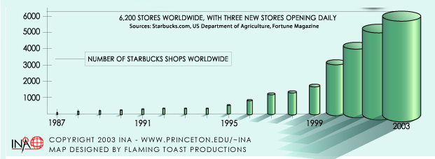
Charts & Graphs: The Incredible Booming Coffee Shop
The bar chart shown above, which is just a detail from a full page "infographic" on the growing number of Starbucks coffee shops1, combines three types of problematic graph in one. For some unknown reason, the "bars" are actually cylinders, that is, three-dimensional―how did the designer managed to resist the temptation to turn them into Starbucks coffee cups? This is not a problem per se, but the addition of depth to the graph adds no new information and, as I explained a decade ago2, risks misleading the viewer. Here are the three problems:
- Adding the third dimension to the chart makes it ambiguous whether the height of the "bars" is to be measured by their cylindrical top, or by their two-dimensional edge. These are not the same because, as the chart is drawn, we seem to be looking down at an angle on the cylinders. Judging from the last cylinder's height, it appears to represent 6K stores in 2003. However, if you look closely you'll see a thin line stretching from the top edge of the cylinder over to the lefthand scale. Moreover, the top of the chart tells us that there were 6,200 shops at the time the graph was published, which seems to be verified by the position at which the thin line meets the scale. So, it seems to be the visual edge of each "bar" that represents the number of shops, rather than the top of the cylinder.
The main effect of the extra dimension is to make it difficult to read the numbers of shops represented by the other "bars" from the scale. For instance, how many stores were there in 2000? It appears there were somewhere between 3,000 and 3,500, but it's difficult to be more precise. The chartmaker might defend it on the grounds that no one really wants to know the exact number of shops for any given year, and that the point of the chart is just to show the enormous growth of Starbucks, but a linear graph would be a better way to do it.
- Another problem3 with this chart is that the width of the cylinders increases with their height but, as we've seen, the data is represented only by their heights. The extra width of the taller bars can exaggerate the difference between those of different heights. For instance, the cylinder for the year 2000 represents about half as many shops as that for 2003, yet the latter cylinder is about four times larger in area. As a result, the casual viewer is likely to overestimate the increase in numbers.
In addition, if the bars really were cylinders, then the 2003 one would have approximately eight times the volume of the 2000 one. In mentally comparing them, the viewer may tend to compare their apparent volumes rather than their heights or even areas. The only way for a viewer to correctly compare the bars in this chart is to ignore the fact that they are portrayed as cylinders and compare their heights, not their areas or volumes.
- The above two problems we've seen before, but I've never seen the like of this third one4: the larger cylinders at the right side of the chart seem to advance towards the viewer. This is shown by the overlapping of the later bars, their advancing shadows, and their bottoms getting farther from the baseline. This creates a trick of perspective that makes the later cylinders appear closer to the viewer, and thus visually larger.
All three of these 3D effects tend to exaggerate the increase in the number of Starbucks shops. If this chart were put out by Starbucks, I would suspect that the company was trying to exaggerate its growth to impress people. Since it seems to come from a neutral organization, I suppose the only reason for the exaggeration is to create a more visually exciting chart. A plain bar chart is very boring but there ought to be a way to make it more fun to look at without misleading people.
Notes:
- You can see the full graphic here: "Infographic", International Networks Archive, accessed: 9/20/2023.
- The 3D Bar Chart, Part 1, 6/3/2013.
- For more on this problem, see: The One-Dimensional Pictograph, 8/1/2013.
- The following entry discusses a similar, but not identical, problem: The 3D Bar Chart, Part 2, 7/11/2013
September 14th, 2023 (Permalink)
Headline
Nasa jet travels 850 miles in 10 seconds1
That seems fast, but how fast is it? Does it seem credible that a jet could travel that fast? Last year, I posted a short series on credibility checking2, and this headline is a good candidate for such a check.
The headline expresses the jet's speed in a way that's difficult to evaluate, since we're used to speeds expressed in miles per hour (MPH) or kilometers per hour, and I've never before seen a speed expressed in miles per ten seconds. So, how fast would that be in miles per hour? Take ten seconds if you're fast, or a minute or two if you're more my speed, to convert the headline into MPH.
So that you can check your work, here are my calculations. Since there are sixty seconds in a minute, there are six ten-second periods per minute. So, the jet was going 6 × 850 = 5,100 miles per minute, and given that there are sixty minutes in an hour, it was travelling at 60 × 5,100 = 306,000 MPH. That is fast!
At this point, if not before, your skeptical sense should start tingling. Is that speed plausible? To find out, let's read down in the article beneath the headline:
An aircraft that can fly at ten times the speed of sound will be tested over the Pacific Ocean today—possibly leading to “hypersonic” cruise missiles that could travel from Los Angeles to Pyongyang in less than an hour. The aircraft was designed by Nasa to travel 850 miles in just ten seconds, or 7,000mph.3
Hold on! 7K MPH is a lot less than 306K MPH; in fact, the latter is almost 44 times faster. Obviously, the two claims about the jet's speed are inconsistent: either it doesn't go 850 miles in ten seconds or it's much faster than 7K MPH.
It seems to me that 306K MPH is highly implausible, but let's do some research to find out for sure. According to NASA itself4, the jet in question, which was known as the X-43A, reached the speed of 7K MPH or almost ten times the speed of sound, which is a little over 760 MPH5.
So, where did the author of the article get the notion that the jet travelled 850 miles in ten seconds? I'm not sure, but a NASA press release6 states that during a later flight the jet would travel 850 miles and its engine would fire for eleven seconds. If you assume that the engine was firing the entire time of the 850 mile flight, then you would conclude that the jet flew 850 miles in a little over ten seconds. However, given that its speed was only a little over 7K MPH, the engine must have fired only for the first eleven seconds of that flight, and the entire flight must have lasted over seven minutes.
As I pointed out in a previous entry:
When it comes to high speeds, we quickly run out of landmarks by which to judge claims for plausibility. Our experience with speeds is very limited, and anything over around a hundred MPH is just "really fast".7
How could the author or editor of the article have avoided such an egregious error? Someone should have taken the minute or two to convert the headline claim from the unfamiliar units of miles-per-ten-minutes into the familiar MPH, as we did above. Such unusual units should be avoided because they are both unintuitive and difficult to compare with the usual ones. If that had been done, the implausibility of the headline would have been obvious, as well as the difference with the later claim that the jet's speed was 7K MPH.
Surprisingly, the article has never been corrected, despite the fact that it will be two decades old next year.
Notes:
- Chris Ayres, "Nasa jet travels 850 miles in 10 seconds", The Times, 11/16/2004. Via: Brian W. Kernighan, Millions Billions Zillions: Defending Yourself in a World of Too Many Numbers (2018), p. 43.
- See:
- Compare & Contrast, 1/7/2022
- Divide & Conquer, 2/4/2022
- Ratios, Rates & Percentages, 3/27/2022
- Ballpark Estimation, 4/21/2022
- Paragraphing suppressed.
- "NASA's X-43A Scramjet Breaks Speed Record", NASA, 11/16/2004.
- "what is the speed of sound", Wolfram Alpha, accessed: 9/14/2023.
- "NASA X-43A 'Scramjet' Readied For Mach 10 Flight", NASA, 11/9/2004.
- Faster Than a Speeding Bullet, 1/12/2019.
September 11th, 2023 (Permalink)
How to Solve a Problem: Divide and Conquer1
Try solving the following problem.
Problem 1: A Puzzle in Woodpecker Woods
An ornithologist studying the birds in Woodpecker Woods made the following observations:
- All the yellowbellies are sapsuckers.
- Some of the blackbacks are redheads.
- None of the sapsuckers are redheads.
What could the ornithologist conclude is the relation between yellowbellies and blackbacks in Woodpecker Woods?
Note: This is a logic puzzle and not necessarily ornithologically correct, so knowledge about birds will not help solve it and may even mislead you. Base your answer entirely on the above clues.
If you try to solve this problem directly, you may find it difficult because there are three clues and four classes: yellowbellies, sapsuckers, blackbacks, and redheads2. What you'll probably need to do is take the problem two clues at a time. Which two clues should you use? Look for two clues that have a class in common: clues 1 and 3, which share "sapsuckers", and clues 2 and 3, which share "redheads". Since these pairs of clues have only three classes among them, you can use a Venn diagram or whatever technique you please; you may even be able to do them in your head. You could pick either of these duos to solve the puzzle, but I'll show how using 1 and 3:
- Clues 1 & 3: From these two clues we can conclude that no yellowbellies are redheads.
- Step 1 & Clue 2: Using the conclusion of the previous step together with clue 2, we can conclude that some blackbacks are not yellowbellies, which is the solution to the puzzle.
This was an inferential problem, that is, it asked you to infer something from a group of premisses. While there are advanced methods to solve such a problem directly from all the premisses, it's usually easier to break it down into two or more simpler problems. This is what I mean by "divide and conquer": solving a complex and difficult problem by breaking it down into simpler ones, because simpler is easier.
In a previous entry3, I mentioned how the primary technique for solving jigsaw puzzles is hill-climbing, that is, adding pieces to the puzzle until there are no longer any left to add. As anyone who has ever worked a jigsaw will have noticed, they tend to get easier as you go along, and the hardest part of the puzzle is getting started. The reason is that the problem space4 of the puzzle is largest at the beginning and decreases with every added piece; for instance, if the puzzle has a thousand pieces, then you have to start looking through that many pieces to find two that fit together. To do so systematically, you'd need to make almost a million comparisons―more precisely, 1,000 × 999 = 999,000―so a systematic search is impractical. What can you do?
The usual strategy for solving a jigsaw puzzle is to start out by sorting the pieces into at least two piles: border pieces and interior pieces. It's easy to tell border pieces and interior ones apart because those on the border have one straight edge. Once the pieces have been sorted into two piles, put the interior pieces aside and work on the border of the puzzle first. Assuming that a thousand piece puzzle has a hundred edge pieces, assembling the border of the puzzle first reduces the problem space by a factor of a hundred5.
In effect, this procedure turns one big puzzle into two smaller ones: the border puzzle and the interior puzzle. In this way, the problem space is reduced to more manageable sizes. In other words, you "divide and conquer" it.
As with the other problem-solving techniques we've looked at in this series, it's not always possible to divide a problem into smaller ones, but it is a possibility to consider, especially when confronted by a large and difficult problem.
Now, here's a chance for you to practice using your new tool.
Problem 2: The Three Stooges Gang
A major bank robbery is being investigated by the police, who suspect that a gang known as "the three stooges" committed it. The stooges are three thieves who rob banks and jewelry stores wearing masks representing the members of the famous comedy team they were named after. The original members of the gang were three crooks who had met in prison and started working together on their release. The three were always fighting with each other, and the police had heard rumors that two of them were on the outs. So, it was always possible that one or more of the original stooges might not have participated in the robbery.
The police interviewed their confidential informants (CIs) to find out what the word in the underworld was on the robbery and the gang. I will refer to the usual members of the gang as "Moe", "Larry", and "Curly" to protect the innocent. The police gathered the following clues from the CIs:
- If Moe didn't plan the robbery, then Larry participated but not Curly.
- Either Curly was involved in the crime or Larry wasn't.
- Larry didn't participate in the robbery if and only if both Moe planned it and Curly was included.
Assuming that what the CIs said is correct, who if any among the original three stooges was involved in the robbery?
Divide and Conquer
Moe planned the robbery and Curly participated, but Larry was not included.
Explanation: Like a jigsaw puzzle, the hardest part of this puzzle is getting started. You don't have a lot to work with; just an "if", an "or", and an "if and only if". One way to get started is to split the disjunctive clue―2―into two parts by assuming each disjunct in turn. Whatever turns out to be true under both of these assumptions will be true for the problem as a whole, which is known as "argument by cases".
Clue 2 tells us that either Curly was involved in the crime or Larry wasn't, so let's see what happens when we assume each of these in turn:
- Suppose that Curly was involved. From clue 1, we know that if Moe didn't plan the caper then Larry was involved but not Curly. But we just assumed that Curly was involved, so we can infer that Moe did plan it. Moreover, if Moe planned it and Curly participated, then Larry must not have been involved, by clue 3. To sum up: Moe planned the crime, Curly participated, but Larry wasn't involved.
- Suppose that Larry was not involved. Then Moe was the planner and Curly was involved, by clue 3.
In either case, we have the same conclusion: Moe planned the crime, Curly participated, but Larry wasn't involved.
So, the above solution worked by dividing the puzzle into two simpler puzzles and conquering each. As is usually the case, this is not the only way to solve this problem, and some methods might not require dividing and conquering, but it's good to have another tool in your problem-solving toolbox.
Notes:
- For previous entries in this series, see:
- Contraction, 4/6/2023
- Think Backwards, 5/5/2023
- Solving a Problem by Elimination, 6/20/2023
- Climbing Up that Hill, 7/5/2023
- Backtracking, 8/14/2023
- If you're familiar with traditional logic, you might notice that the three clues are each categorical statements. If there were only two clues and three classes, you could treat it as a categorical syllogism, for which there are established techniques. As it is, there are three statements with four class terms among them, so it's impossible to make a single syllogism out of them. Similarly, if you know how to use Venn diagrams, you might think to represent the logical relations between the four classes in a diagram, but the standard "pretzel" diagram only relates three classes. There are diagrams for more than three classes, but they tend to be less intuitive and harder to use. See Martin Gardner's Logic Machines and Diagrams (2nd edition, 1982), chapter 2.
- Climbing Up that Hill, 7/5/2023.
- By the "problem space" of a puzzle I mean the class of all possible solutions to it.
- The number of comparisons is 100 × 99 = 9,900, which is one-hundredth of that for the full puzzle.
September 4th, 2023 (Permalink)
Famously Infamous
This year is the eightieth anniversary of Operation Chastise, the so-called dambusters bombing raids of World War Two1. The raids, conducted by Britain's Royal Air Force, took place on May 16th and 17th of 1943 and aimed at destroying three dams along the Ruhr river where Germany's war industry was concentrated. The operation was largely successful as two of the dams were sufficiently damaged to flood the river valley2. However, as interesting as this true story is, this is not a history lesson; rather, it's prompted by a BBC television presenter named Sally Nugent who, in commenting on the anniversary, called the raids "infamous"3.
If you only knew the word "famous" and the prefix "in-", you would probably think that "infamous" means "not famous" since "in-" is a negative prefix, but there's another way to be negative. Instead of "non-famous", "infamous" means famous for something negative4, so that calling the dambusters raids "infamous" means they are famous in some bad way. While the raids are no doubt famous in England, the fact that the BBC found it necessary to apologize for its presenter's remark shows that they are not infamous.
My guess is that either Nugent or whoever wrote the script she was reading simply didn't know the meaning of "infamous", rather than intending to suggest that the raids were well-known for being bad. Some words with negative meanings, such as "bad" and "sick", are sometimes used in the opposite sense, and I've previously come across "infamous" used in this way.
I don't know how well the dambusters raids are known in the United States nowadays, but I was aware of them from having seen the 1955 movie The Dam Busters5 on television as a boy. As you can tell from the title, this was a fictionalized film version of the famous raids. I was not the only one to see and love the movie: so did a young George Lucas, who based the final scenes of a famous 1977 movie on it6.
Substituting "infamous" for "famous" is the sort of error that neither a spelling nor even grammar checking program can be expected to catch, since both are English adjectives. To notice the substitution of one for the other requires understanding the difference in meaning between the two, and not just spelling or even grammar. I tried the full sentence spoken by Nugent in several online copyediting programs and, unsurprisingly, not a one caught it. So, if you don't want to become as infamous as Nugent, add this distinction to your mental copyeditor.
Notes:
- David McKenna, "Events mark 80th anniversary of Dambusters raids", BBC News, 5/13/2023.
- "The Incredible Story Of The Dambusters Raid", Imperial War Museum, accessed: 9/3/2023.
- Charlie Parker, "BBC apologises for Sally Nugent’s ‘infamous’ Dambusters comment", The Sunday Times, 8/3/2023.
- "Infamous", Cambridge Dictionary, accessed: 9/3/2023.
- Alex von Tunzelmann, "The Dam Busters: hits its targets–and doesn't dumb down", The Grauniad, 8/7/2015.
- Bryan Young, "How The World War II Drama 'The Dam Busters' Influenced The Space Battles Of 'Star Wars: A New Hope'", Slash Film, 5/2/2018.
