Previous Month | RSS/XML | Current | Next Month
WEBLOG
December 25th, 2017 (Permalink)
A Puzzling Christmas Greeting
Here is my Christmas greeting to you:
A B C D E F G H I J K M N O P Q R S T U V W X Y Z
Can you figure out what it means?
December 23rd, 2017 (Permalink)
Quote, Misquote
Who said it?
The strongest reason for the people to retain the right to keep and bear arms is, as a last resort, to protect themselves against tyranny in government.
Some, including economist Walter Williams1, have attributed this statement to Thomas Jefferson. However, there is no reason to think that Jefferson said or wrote this2. Its earliest appearance in print seems to be in 1989, so it was probably concocted about that time. However, who actually created the quote we don't know, except that it probably wasn't Jefferson.
Just as some gun rights advocates misquote Hitler as a proponent of gun registration3, others also misquote the Founding Fathers in support of unrestricted access to firearms. The Hitler misquote smears by association4 those who support restrictions on guns, whereas bogus quotes of the Founding Fathers do the reverse: instead of damning gun registration by associating it with the Nazis5, they appeal to the authority6 of Founders such as Jefferson to support the right to keep and carry guns. Given the second amendment to the constitution, I would think it ought to be easy enough to find genuine quotes from the Founders to support that right without having to make them up, but maybe it's just easier to invent them than do boring research.
Notes:
- Walter E. Williams, "To Keep And Bear Arms", George Mason University, 3/24/2000
- See the following sources:
- "Bogus Quotes Attributed to the Founders", GunCite, 9/22/2007
- "Strongest reason for the people to retain the right to keep and bear arms (Spurious Quotation)", Monticello, 1/9/2012
- Dan Evon, "Debarred Arms", Snopes, 6/22/2016
- See, for one example: Who is Adolph Hitler and why does he keep saying these terrible things?, 9/11/2017
- See: Guilt by Association
- See: The Hitler Card
- See: Appeal to Misleading Authority
December 17th, 2017 (Permalink)
Headline
Senators push for funding bill to include money for sexual harassment training*
So far, they've had to learn by doing.
* Jordain Carney, "Senators push for funding bill to include money for sexual harassment training", The Hill, 12/14/2017. Via: Glenn Reynolds, "I Don't See Why, They Seem Pretty Damn Good at it Already", InstaPundit, 12/15/2017.
Hint to a Puzzling Christmas Greeting: Which letter is missing?
December 15th, 2017 (Permalink)
Charts & Graphs:
A Half-Baked Pie Chart
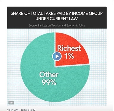
Before you read any further, take a look at the pie chart to the right. What do you make of it?
I came across this chart in a column by mathematician Keith Devlin1, who focuses on the fact that the chart seems to show a pie cut into two pieces, one representing the richest 1% and the other the remaining 99%. However, the "1%" piece looks to be about 23% or 24% of the pie, leaving the "99%" piece representing the remaining 76% or 77%.
First, here's a brief explanation of what the chart is actually trying to convey―if you need more, see Devlin's discussion. A careful reading of the title of the chart reveals that the pieces of the pie actually represent the share of taxes paid by each income group, not the income groups themselves. In other words, the richest 1% pay about 24% of taxes, whereas the remaining 99% of us pay only the remaining 76%.
This combination of two sets of percentages in one pie chart―percent of the population in terms of wealth, and percent of federal tax paid―is confusing, but I doubt that anyone would be seriously fooled by it. Since the percentages and the sizes of the slices are so at odds, one is led to read the title of the chart to resolve the confusion. I want to focus, instead, on a couple of other problems that Devlin does not comment on, one of which I think is more seriously deceptive.
One problem with this chart that Devlin does not discuss is that a graph of any kind is unnecessary to convey this information. With only two income groups being compared, it is easier and clearer to do so in words. As it is, the chart just confuses matters. One of the earliest questions you should ask yourself before making a graph is: Can this data be more easily understood in a graph than in words? If not, don't do it. Charts shouldn't just be pretty pictures to adorn your words, and they especially shouldn't be misleading pictures unless your goal is to mislead people.
The pie chart was put out by a group called "Tax March"2, which organized a number of marches earlier this year to protest President Trump's refusal to make public all of his tax returns. In other words, it's an anti-Trump political pressure group. Now, this doesn't necessarily mean that the pie chart was intended to mislead people, even if it had that effect, but it does mean that it deserves no benefit of the doubt. This is a group with an agenda, and anything they put out should be treated with skepticism. As Ronald Reagan should have said: "Don't trust; verify!"
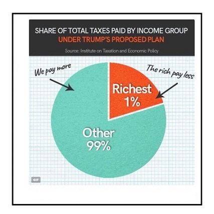
The original graph was an animated GIF that if clicked on would produce the following additional chart3. Here, you can see the point of the chart: the piece of the pie representing the tax share of the wealthiest 1% shrinks from about 24% to approximately 20%, with the remaining piece increasing a proportional amount. If you don't get the point, the second chart provides the helpful pointers: "The rich pay less" and "We pay more".
But do we non-rich folks really pay more? Now, this is not a fact check, it's a logic check, so I'm just going to assume that the percentages shown by both charts are correct.
What worries me is the words: "We pay more": "more" what? This is a dangling comparative, that is, a comparison lacking one of the items compared. "We pay more" could mean that we, the 99%, pay more taxes than we used to. In fact, that is what I expect most people who see the chart will believe. However, what the chart shows is that we, the 99%, will pay a larger share of the total tax burden, which is not the same thing as paying more taxes.
If this point isn't sufficiently clear, think about it this way: Suppose that the entire amount of federal tax paid is a billion dollars, and that the top 1% in income pay 240 million of that, which is 24% of the total. That means that the remaining 99% of taxpayers would pay 760 million, or 76%.
Suppose, further, that an across-the-board tax cut reduced the total amount of tax paid to 900 million, of which 180 million―20% of the total―is paid by the richest 1%, and 720 million comes from the rest of us―80%. In this scenario, everyone is paying less tax, but the share paid by 99% has increased. For all that we can tell from the chart, this is what will happen under the proposed tax plan.
How many people who look at this chart will come away thinking that the rich are getting a tax cut, but the rest of us will actually end up with a tax raise? I expect that it's probably less than 99%, but much greater than 1%.
Notes:
- Keith Devlin, "Clash of representations", Devlin's Angle, 12/14/2017.
- See: Matt Stevens, "The Tax March Explained: Protesters Hope to Pressure Trump Into Releasing Returns", The New York Times, 4/15/2017. I'm pleased that they didn't decide to call themselves "the Million Person Plus One Giant Inflatable Chicken March", or the like; see: The Million "Million X March" March, 6/18/2014.
- I was unable to find the original of this chart, so I'm copying only the unclickable version supplied in Devlin's column.
December 2nd, 2017 (Permalink)
New Book: Dollars and Sense
Thankfully, I have no complaints about the title of Dan Ariely's new book with Jeff Kreisler. But, what's up with this subtitle: "How We Misthink Money and How to Spend Smarter"? How can we "misthink" money if we can't think it? I think I understand what the subtitle is getting at: this is a book about the mistakes we tend to make in thinking about money, and how to avoid them.
Ariely is a psychologist and author of the previous book Predictably Irrational, which I've read and referred to in passing here. It's been almost ten years since I read that book, so unfortunately I don't remember much about it. In the intervening years, Ariely has written some other books that I haven't read, including The Upside of Irrationality―whose title I was put off by, as I don't think irrationality has an "upside". I am interested in reading the new book because I could benefit from learning how to avoid financial mistakes. Couldn't we all?
December 1st, 2017 (Permalink)
What's New?
This weblog has been rather quiet for the last month or two because I've been engaged in the long-delayed project of revising all of the fallacy entries. As part of that project, I've added a new fallacy: The Fallacy of the Heap! More accurately, it's sort-of new, because this is the same fallacy of vagueness that used to be listed under the name "Slippery Slope", along with the causal fallacy of the same name. In other words, it's a new entry for an old fallacy under a new name.
I'm in the process of splitting the old Slippery Slope entry into two distinct entries, one for the fallacy of vagueness, and the other for the causal fallacy. The first part of that task is now done. As mentioned in the new entry, the Fallacy of the Heap is sometimes referred to as "the slippery slope fallacy". However, "slippery slope" is most commonly used to refer to the causal mistake. Though, as explained in the new entry, the vagueness and causal fallacies are sometimes related, they are distinct fallacies and for that reason should have distinct entries and distinct names. There's reason to believe that some readers were confused by two different fallacies being discussed in the same entry under the same name, so this change should clear that up. For the time being, the entry for Slippery Slope is still the same old entry, but will soon be revised to cover only the causal fallacy.
New Fallacy: The Fallacy of the Heap
Solution to a Puzzling Christmas Greeting: Noel.*
* Martin Gardner, Codes, Ciphers and Secret Writing (1984), p. 46