WEBLOG
Previous Month | RSS/XML | Current | Next Month
February 19th, 2014 (Permalink)
Another Doublespeak Dictionary Puzzle
What does "orthographically impaired" mean, as in the sentence: "The headline writers at Slate are orthographically impaired"?
Source: Hugh Rawson, Dictionary of Euphemisms and Other Doubletalk, Revised Edition (1995)
February 17th, 2014 (Permalink)
What is a P-value?
I have some comments on a recent article in Nature by Regina Nuzzo concerning statistical problems in scientific research. I've discussed many of these problems here in recent years, and they concern some of the probabilistic fallacies in the files, which I will mention by name later. The article is well worth reading and neither very long nor very technical―see the Source, below―so I recommend reading it before my comments.
I want to add some additional explanation to the article, as well as to tie it in explicitly with the fallacies and problems I've discussed here before. Here's how the article explains what a P-value is:
…[W]hen UK statistician Ronald Fisher introduced the P value in the 1920s, he did not mean it to be a definitive test. He intended it simply as an informal way to judge whether evidence was significant in the old-fashioned sense: worthy of a second look. The idea was to run an experiment, then see if the results were consistent with what random chance might produce. … This probability was the P value. … For all the P value's apparent precision, Fisher intended it to be just one part of a fluid, non-numerical process that blended data and background knowledge to lead to scientific conclusions.
In other words, the P-value―"P" for "probability"―just tells you the probability that the result of a study is due to chance. Nuzzo continues:
…[There] is an abundance of confusion about what the P value means. … Most scientists would look at … [a] P value of 0.01 and say that there was just a 1% chance of … [the] result being a false alarm. But they would be wrong. The P value cannot say this.
That is, the P-value is not the probability that the experimental hypothesis is false. If a study has a low P-value, that means its results are unlikely to be due to chance. However, the P-value does not tell you what other than chance may be responsible for those results. Typically, scientists begin research with an hypothesis that they wish to test, and if the test has a low P-value they may conclude that the hypothesis is true. However, the P-value is not itself a measure of the unlikelihood of the hypothesis, nor is the probability that the hypothesis is true simply 1 minus the P-value.
[The P value] cannot work backwards and make statements about the underlying reality. That requires another piece of information: the odds that a real effect was there in the first place.
What Nuzzo is alluding to here is the so-called "prior probability" of the experimental hypothesis, which is one of the values one needs in order to use Bayes' theorem to determine the "posterior probability" of that hypothesis, which is what we want to know―for Bayes' theorem, see the entry for Probabilistic Fallacy.
To ignore this would be like waking up with a headache and concluding that you have a rare brain tumour―possible, but so unlikely that it requires a lot more evidence to supersede an everyday explanation such as an allergic reaction.
This is an example of the base rate fallacy, that is, the mistake of neglecting to take into consideration the prior probability of a hypothesis. The "base rate" of brain tumors is much lower―they're "rare"―than the prior probability of allergic reactions, so that the headache is more likely to be due to an allergy than to a tumor.
The more implausible the hypothesis―telepathy, aliens, homeopathy―the greater the chance that an exciting finding is a false alarm, no matter what the P value is.
This is related to Carl Sagan's slogan that "extraordinary claims require extraordinary evidence", and both are consequences of Bayes' theorem: the lower the prior probability of a hypothesis, the stronger the evidence needed to raise the posterior probability to a level worth taking seriously.
Critics also bemoan the way that P values can encourage muddled thinking. A prime example is their tendency to deflect attention from the actual size of an effect. … To pounce on tiny P values and ignore the larger question is to fall prey to the �seductive certainty of significance�, says Geoff Cumming, an emeritus psychologist at La Trobe University in Melbourne, Australia. But significance is no indicator of practical relevance, he says: �We should be asking, 'How much of an effect is there?', not 'Is there an effect?'�
This is a different type of problem than those discussed previously by Nuzzo, each of which was related to understanding probability, especially in relationship to Bayes' theorem. She is referring to the danger of equivocating on the meaning of the word "significant" in the phrase "statistically significant".
To say that the result of a scientific study is "statistically significant" simply means that the P-value is less than or equal to a somewhat arbitrary "level of significance", which is usually set at .05. So, a statistically significant result is just one that is unlikely to have happened by chance; specifically, it usually means that there is less than or equal to one chance in twenty. This says nothing at all about whether the result is "important" or "significant" in any other sense.
However, this is not a "black or white" issue: There's no reason why we can't ask and answer both of Cumming's questions, and attend to both the statistical "significance" and the practical importance of scientific results.
Source: Regina Nuzzo, "Scientific Method: Statistical Errors", Nature, 2/12/2014.
Resource: Steven Novella, "P-Hacking and Other Statistical Sins", NeuroLogica, 2/13/2014.
Fallacies:
February 14th, 2014 (Permalink)
Charts & Graphs:
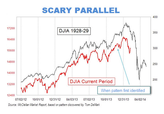
A Not-So-Scary Parallel
If you followed along in the "Charts & Graphs" series from last year, you ought to be able to see what's wrong with the chart above. If you didn't, what're you waiting for?―see the Lessons, below.
The chart shows two lines representing the Dow Jones Industrial Average (DJIA): the black line showing the DJIA from 1928-1929―that is, the period leading up to and including the stock market crash of 1929; and the red line representing the DJIA in the last year and a half. As suggested by the chart's scary title "Scary Parallel", you're supposed to notice the similarity between the two lines up to the end of the red line, and then extrapolate the red line into the future following the lead of the black line. In other words, the chart represents a visual argument that we're currently heading for a stock market crash similar to the one shown by the black line's Black Tuesday.
Can you explain why you shouldn't be so scared by this scary parallel? If you think you can, click on the link below.
Why is the parallel not so scary?
Lessons in Charts & Graphs: 1, 2, 3, 4, 5, 6, 7, 8, 9
February 12th, 2014 (Permalink)
New Book: The Critical Thinker's Dictionary
Philosopher Robert Todd Carroll of Skeptic's Dictionary fame has now produced a Critical Thinker's Dictionary. Judging from the Table of Contents, it covers many of the classic fallacies together with a few less familiar ones, such as the regressive and Texas sharpshooter fallacies. There are also entries for most of the cognitive biases and illusions discovered by psychologists in recent decades, which is unusual for a book on critical thinking but a welcome development. Unfortunately, it appears to be available only as a Kindle book, but the price is certainly right!
Source: Robert Todd Carroll, The Critical Thinker's Dictionary: Biases, Fallacies, and Illusions and What You Can Do About Them (2013)
February 11th, 2014 (Permalink)
Name That Fallacy!
Your argument must be coherent if I'm to understand it. Because I can't understand it, it must be incoherent.
Can you name the fallacy committed in the above passage? If you think you can, click the link below.
Source: "Ham Sandwich Town", Really Funny Pictures
February 9th, 2014 (Permalink)
Headlines
The Gayest Olympics Ever
Decoding the Anti-Gay Messages in the Olympics Opening Ceremony
Next on Slate: Have your cake. Eat it, too!
Sources:
- Simon Doonan, "The Gayest Olympics Ever", Slate, 2/7/2014
- June Thomas, "Decoding the Anti-Gay Messages in the Olympics Opening Ceremony", Slate, 2/7/2014
Answer to Another Doublespeak Dictionary Puzzle: To be orthographically impaired is to be bad at spelling.
Update (3/5/2014): Here's more evidence of the orthographic impairment of Slate headlines:
Xeno's Paradox, Solved
This was the headline on Slate's front page today for an excellent article on Zeno's famous paradox of Achilles and the tortoise, despite the fact that the philosopher's name was spelled correctly in the article itself.
Why the parallel is not so scary: This is a YY chart―see the Resource, below―and exhibits the problems typical of graphs with two Y-axes. Whoever made the graph has manipulated the Y-axes in order to make the two lines appear to be more similar than they really are.
It's clear from the labels on the Y-axes that the scales have been carefully chosen for a close match between the two lines: the right axis, for 1928-1929 extends from a low of 150 to a high of 400, for a range of 250 points. The black line itself ranges from a low of about 200 to a high in the vicinity of 375, thus ranging over around 175 points. In contrast, the left axis, for the current time period, starts at 12,400 and extends to 18,000, for a range of 5,600 points. So, the left axis is over 22 times the size of the right one. The red line ranges from a low of about 12,800 to a high in the vicinity of 16,400, thus covering 3,600 points. So, the range of the current period is over twenty times that from the '20s. This chart isn't comparing apples to oranges; it's comparing mountains to molehills.
Moreover, placing the two lines alongside each other, together with the alarming title on the graph, suggests that it's not just a coincidence that the lines look alike, and that we should be worried that a stock market crash is imminent. However, since the two lines have been manipulated to make them look similar, there's no reason to think that the future will continue to resemble the past.
Sources:
- Kaiser Fung, "A Message Worth Repeating", Junk Charts, 2/13/2014
- Matthew O'Brien, "That Viral Chart Predicting Another 1929 Stock-Market Crash? It's Absurd", The Atlantic, 2/11/2014
Resource: Charts & Graphs: The YY Graph, 11/19/2013
Update (4/2/2014): The current date is the same as the last marked date on the X-axis of the "Scary Parallel" chart, and the DJIA stands at 16,573, according to Wolfram Alpha. This is well above where it ought to be if the frighteningly similar pattern had held, so I think it's not too early to declare this scary chart a false alarm.
Naming That Fallacy: This example is a good opportunity to practise your skills at analysing the structure of an argument―you can refresh your memory with brief lessons on the relevant skills in the Resources below. That the passage contains an argument is indicated by the word "because" at the beginning of the second sentence, which is an argument-indicator word; more specifically, it's a premiss-indicator word―see Lesson 6 in the Resources, below. As such, it indicates that the statement it prefaces is a premiss, that is: "I can't understand [your argument]."
In sentences of the form "Because p, q", q is usually the conclusion supported by p. If so, the conclusion of the argument is: "[Your argument] must be incoherent." Finally, unless it's irrelevant, which is unlikely, the first sentence is an additional premiss. Thus, the argument has the following structure:
Premiss 1: Your argument must be coherent if I'm to understand it.
Premiss 2: I can't understand [your argument].
Conclusion: [Your argument] must be incoherent.
The first premiss is a type of conditional statement, and the word "if" indicates that its second component is the antecedent, that is: "I'm to understand [your argument]". So, the consequent of the conditional premiss is the first component: "Your argument is coherent"―the "must" here plays a special logical role in indicating that the whole conditional statement is necessarily true. So, the first premiss can be reworded as: "If I'm to understand your argument then it must be coherent."
An additional point about logical structure is that the argument contains two negations: one in the second premiss and one in the conclusion. The second premiss is the negation of the statement: "I can understand your argument", while the conclusion is the negation of the statement: "Your argument is coherent". These negative statements can be reworded to make the negations explicit by prefacing the negated statements with "it is not the case that."
Putting this all together, the whole argument can be reworded to make its logical structure apparent:
Premiss 1: If I'm to understand your argument then it must be coherent.
Premiss 2: It's not the case that I can understand your argument.
Conclusion: It's not the case that your argument is coherent.
Now, it's apparent that the second premiss is the denial of the antecedent of the first, and the conclusion is the denial of the consequent of the first premiss. Thus, the argument has the form of the formal propositional fallacy of denying the antecedent.
Fallacy: Denying the Antecedent
Sources:
- "Creationist Ken", Twitter, 2/9/2014. The example comes from this "tweet" by creationist Ken Ham.
- "Marc D. Barnhill", Twitter
Resources:
- Lessons in Logic 6: Premiss Indicators, 6/12/2007
- Lessons in Logic 7: Argument Analysis, 7/31/2007