WEBLOG
Previous Month | RSS/XML | Current | Next Month
September 30th, 2012 (Permalink)
Headline
Defendant's Speech Ends in Long Sentence
Source: Richard Lederer, Anguished English (1989), p. 84
September 28th, 2012 (Permalink)
End of Blurb Watch
An ad for the new movie End of Watch attributes four-star reviews to ten different newspapers―more accurately, nine newspapers and one television channel (Fox). This may make it seem as though the movie has received almost universal critical acclaim, but there's less here than meets the eye.
We've seen previously that ads for movies sometimes tout four-star reviews without mentioning that more than four stars may be possible. This ad is no different, since at least four of the newspapers listed use a five-star rating system. Furthermore, two of the newspapers listed―The San Francisco Chronicle and The Houston Chronicle―appear to have published reviews by the same critic: Amy Biancolli. So, there are really only nine critics listed, and at least four―I couldn't find the Fox review―use five star rating systems. So, End of Watch is a well-reviewed movie; just not as well as they'd like you to think.
Sources:
- Ad for End of Watch, New York Times, 9/28/2012, p. C12
- Henry Barnes, "End of Watch―review", The Guardian, 9/8/2012
- Amy Biancolli, "'End of Watch' a ride-along on LAPD roller coaster", The Houston Chronicle, 9/20/2012
- Amy Biancolli, "'End of Watch' review: tense, eye catching", The San Francisco Chronicle, 9/20/2012
- Bill Goodykoontz, "�End of Watch,� 4 stars", The Arizona Republic, 9/19/2012
- Elizabeth Weitzman, "Movie Review: 'End of Watch'", New York Daily News, 9/20/2012
September 25th, 2012 (Permalink)
Charts & Graphs
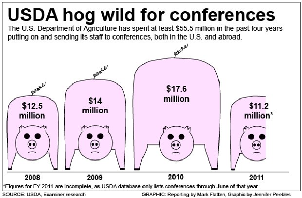
An article from yesterday's Washington Examiner about the amount of money spent by the Department of Agriculture (USDA) on conferences displays the chart shown, which portrays three and two-thirds stylized pigs. Each pig represents the amount of money spent by the USDA in one year, with the last pig only partially shown because it represents last year for which only partial data is available.
If you don't pay attention to the figures on the backs of the pigs, you're likely to get the impression that from 2009 to 2010 the amount spent on conferences approximately doubled, while from 2008 to 2010 it nearly tripled. However, the actual increases are much smaller than that, as can be seen from the figures. This is because it is the height of each pig that represents the amount spent, rather than the area. Yet, if you're not careful, you'll likely judge the comparative sizes of amounts based on area.
This is another type of potentially misleading chart that Darrell Huff warned us about over fifty years ago (see the Source, below), namely, a bar chart in which pictures replace the bars. In a bar chart, the bars should all be the same width, making it clear that it is the height of the bars that conveys information. In contrast, when the height of a picture changes and its proportions remain the same, the width also changes. At the very least, such a chart is ambiguous as to whether height or area represents amounts, since you can't tell just by looking. Instead, you have to look at the figures and compare them to the pictures, which obviates much of the value of a graph in the first place. In this case, why not just give the figures?
Sources:
- "Article Photos: Watchdog: USDA spends millions for globe-trotting conferences", The Washington Examiner, 9/24/2012
- Darrell Huff, How to Lie with Statistics (1954), Chapter 6: "The One-Dimensional Picture"
- Naomi Robbins, "Misleading Graphs: Displaying a Change in One Variable Using Area or Volume", Forbes, 2/28/2012
Previous "Charts & Graphs":
- Mixed-Up Logic Check, 1/26/2012
- Hey, Big Spender, 6/1/2012
- Charts and Graphs, 6/4/2012
- A "Gee-Whiz" Graph, 8/14/2012
September 17th, 2012 (Permalink)
The Worst Social Statistic Ever?
In 1995, an academic journal published the following claim: "Every year since 1950, the number of American children gunned down has doubled." Was this a plausible statement in 1995? How would you go about checking it for sanity? To keep things simple, let's make the conservative assumption that only one child was "gunned down" in 1950. So, can you estimate how many would have been gunned down by 1995 if the claim were true? After you've made your own estimate, check out the "Back of the Envelope" below.
September 11th, 2012 (Permalink)
How Many Orphans?
How many children were orphaned by the terrorist attacks of September 11th, 2001? Apparently, estimates have gone as high as 15,000, but about a month after the attacks The New York Times published an article stating that there were no children orphaned by the attacks, and calling the claim that there were "an urban myth". However, there still exists a Twin Towers Orphan Fund (see the Sources, below, for a link) that claims to help 1,200 children. So, what's going on here?
Given that fewer than 3,000 people died in the attacks, an estimate of 15,000 is an implausibly high number of orphans, as a back-of-the-envelope calculation will show: even if each of the 3,000 was a widow or widower with children, that would mean an average of five children per person. However, it appears that this may have been an early estimate based on higher casualty estimates that were later revised downward. But is it really an "urban myth" that there were children orphaned in the attacks? And what about those 1,200 children helped by the orphan fund?
It turns out that it all depends on what you mean by "orphan". If you mean a child both of whose parents are dead, the Times appears to be right that no children were made orphans by the attacks. However, there is a less common meaning of the word "orphan", namely, a child that has lost at least one parent, and this is the definition used by the Twin Towers Orphan Fund.
The first step in counting anything is to define what it is you're counting. So, whenever there is a discrepancy in counts, check the definitions!
Sources:
- "About TTOF―Overview", Twin Towers Orphan Fund
- Nina Bernstein, "Thousands of Orphans? An Urban Myth", The New York Times, 10/26/2001
September 10th, 2012 (Permalink)
Getting it Right
As I've complained before (see the Resource, below), magazines and newspapers are often quick to correct trifling errors, such as misspelled names, but hesitant to correct more significant ones. Take as an example the recent obituary in The New York Times of the photographer Horst Faas. Though Faas did not take it himself, he was connected with a famous photograph from the Vietnam war. According to the obituary, the famous photo showed �the aftermath of one of the thousands of bombings in the countryside by American planes: a group of terror-stricken children fleeing the scene, a girl in the middle of the group screaming and naked, her clothes incinerated by burning napalm."
A natural reading of this claim would be that the napalm was dropped by planes of the United States Air Force (USAF) flown by American aviators, but the planes were actually from the South Vietnamese Air Force. Thus, this seems to be a good candidate for a correction, since the obituary might mislead readers as to which country was responsible for the bombing.
However, the Times initially refused to correct the obituary by equivocating on the word "American": while the planes were part of the South Vietnamese Air Force, they were manufactured in the United States, making them "American planes". Thus, argued the Times, the obituary was in fact correct.
While one plausible reading of the phrase "American planes" taken in isolation is "planes manufactured in the United States", in the context of a description of the famous photo the only reasonable meaning is "USAF planes". This is because the place of manufacture of the planes is not a relevant piece of information, whereas the country responsible for the bombing is important to know. Thus, in context, the sentence was in fact misleading.
After a few months of criticism from media myth buster W. Joseph Campbell, the Times finally got around to correcting the obituary by removing the reference to "American planes" and adding a note at the end of the article. Unfortunately, with the offending phrase removed from the article, the correction at the bottom doesn't make much sense. However, it's good that the Times belatedly got it right.
Sources:
- W. Joseph Campbell, "40 years on: The �napalm girl� photo and its associated errors", Media Myth Alert, 6/3/2012
- W. Joseph Campbell, "A sort-of correction from the NYTimes", Media Myth Alert, 8/28/2012
- Paul Vitello, "Horst Faas, Photographer Who Showed Horrors of War, Dies at 79", The New York Times, 5/12/2012
Resource: The Zimmerman Contextomy, 4/25/2012
September 5th, 2012 (Permalink)
A Puzzling List
Consider the following list of sentences:
- Exactly one of the statements on this list is false.
- Exactly two of the statements on this list are false.
- Exactly three of the statements on this list are false.
Assuming that the sentences on this list are either true or false, exactly how many of them are false?
The Back of the Envelope: There's an old puzzle that asks the question: would you rather have, on the one hand, a million dollars; or, on the other hand, a penny today, 2¢ tomorrow, 4¢ the day after, etc.―that is, doubling the amount every day―for a month. Intuitively, it seems unlikely that starting with only a penny you'd wind up with more than a million dollars even in a month. However, on the last day of the month, you would receive 1,073,741,824 pennies, which amounts to $10,737,418.24, and that's not counting all of the pennies you received on earlier days. The point of the story is that when something grows by doubling―or tripling, quadrupling, or other exponential growth―it gets very big very fast.
There are 46 years from 1950 to 1995, which is fifteen more doublings than in a month of thirty-one days. Thus, the number of kids gunned down in 1995 would be well over a billion; to be exact, it would be over 35 trillion. This is why Joel Best has dubbed this "the worst social statistic ever", because it's "hilariously, wildly wrong".
Now, I don't expect you to have worked out the exact number, or even a close estimate of it, but that isn't necessary. All that's necessary is to realize that when things double, they get big fast, and that 45 doublings will produce an absurdly large number. If you just carry out several doublings, starting with one, you'll soon get a sense of how this works. After a mere twenty doublings, the number of kids gunned down in a year would be over a million, which is already implausible.
So, how did such an absurd claim make it into a scholarly journal? The original source of the claim actually read: "The number of American children killed each year by guns has doubled since 1950." At first glance, this may sound the same, but it's actually a plausible claim: that the number of kids killed had doubled once since 1950. In the original statement, the words "each year" give the time frame for the statistic, that is, the number of American kids killed in a year. Thus, the sentence can be reworded without changing its meaning as: "The number of American children killed yearly by guns has doubled since 1950." However, the person who produced "the worst social statistic ever" seems to have read the phrase "each year" as universally quantifying over years, so that the doubling occurs yearly. This is, perhaps, a grammatically possible reading of the original claim, though the result is practically impossible. Thus, the "the worst social statistic ever" commits a fallacy of amphiboly.
Sources:
- Joel Best, Damned Lies and Statistics: Untangling Numbers from the Media, Politicians, and Activists (2001), pp. 1-4
- Doctor Jerry, "Doubling Pennies", The Math Forum at Drexel, 11/26/1996
Solution to a Puzzling List: Assuming that the three sentences are either true or false, only sentence 2 is true.
There are a total of eight (23) assignments of truth-values to the three sentences, so you can solve the puzzle by listing each assignment and then eliminating those that are impossible. However, it simplifies matters a bit to realize that at most one of the three sentences can be true, which eliminates half of the assignments. So, the four remaining assignments are:
- Sentence 1 true, sentences 2 and 3 false.
- Sentence 2 true, sentences 1 and 3 false.
- Sentence 3 true, sentences 1 and 2 false.
- All three sentences false.
However, if all three sentences were false, then sentence 3 would have to be true, which is impossible. Thus, exactly one of the sentences on the list is true. But if exactly one sentence is true, then exactly two sentences are false, which means that sentence 2 must be the true one.
Source: Martin Gardner, Knotted Doughnuts and Other Mathematical Entertainments (1986). The puzzle was suggested by one on page 70.