WEBLOG
Previous Month | RSS/XML | Current | Next Month
August 28th, 2012 (Permalink)
CSI
One of Benjamin Radford's pet peeves in Media Mythmakers is empty verbiage:
We are targeted wherever we turn by people trying to sell us products, persuade us to vote a certain way, or convince us to support their cause. Much of this persuasion…consists of meaningless words or phrases. Meaningless words are not simply a nuisance; they are a form of mental and visual clutter. Our children spend years in school learning how to read so they can understand the meaning of words and sentences, yet as they grow up, they encounter more and more words and phrases that have no meaning.
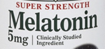
Most of the examples given by Radford aren't, strictly speaking, meaningless; rather, they mean much less than many people may assume. "Clinically studied ingredient" is one such meaning-challenged phrase that seems to be widely used in describing dietary supplements, such as melatonin (see the illustration). That melatonin has been clinically studied may sound like a good thing, but what does it really tell us? What we really need to know are the results of said studies: what, if anything, do the studies show it to be good for? Is it safe to take? Just the fact that someone has clinically studied it tells us little. However, some people who see these words on the label may assume that the fact that it's been studied means that it's been shown to be safe and effective.
We've seen similar phrases before, namely, "emerging science" and "emerging research" (see the Resources, below), which only mean that something has been studied, not that it has been shown to be effective or safe to use. Such phrases suggest more than they literally say, thus protecting those using them from lawsuits, and also fooling some people into buying their products.
Sources:
- "Clinically Studied Ingredient", XKCD
- Benjamin Radford, Media Mythmakers: How Journalists, Activists, and Advertisers Mislead Us (2003), p. 21
Resources:
- "Emerging" Science, 3/26/2006
- "Emerging Research", 3/18/2009
August 21st, 2012 (Permalink)
100% Juice (and Some Other Stuff)
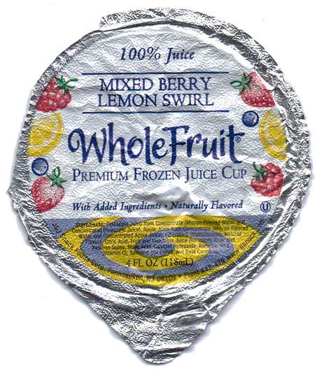
Recently, I drank the juice cup shown to the right. At the top of the label, as you can see, it says "100% Juice". As a literal-minded logician, I was puzzled to read the ingredients listed in the fine print at the bottom. Since they're so small that you probably can't read them, here are the seemingly non-juice ingredients: maltodextrin, citric acid, guar gum, xanthan gum, malic acid, calcium hydroxide, ascorbic acid, turmeric, and beta carotene. I'm not too sure what most of those things are, but they don't sound like juice.
Coincidentally, a few days after drinking the 100%-and-then-some juice, I started reading Benjamin Radford's book Media Mythmakers and was pleasantly surprised to come across the following passage:
The label of the vegetable drink V8, made by the Campbell Soup Company, states proudly not once but twice that it is "100% Vegetable Juice." Yet a glance at the ingredient list reveals that the company has ingeniously managed to define such diverse ingredients as salt, citric acid, vitamin C, and flavoring as "juice." "If," I asked Maria, the pleasant customer service representative at Campbell Soup, "100 percent of your product is juice, then how is there space for what seem to be nonjuice ingredients?" At first she didn't understand what I was talking about, so I repeated the question. After a few seconds, she said, "It's not vegetable juice only." "But if V8 is 100 percent juice," I countered, "that doesn't leave any percent for the non-juice, does it?" We both noted that at the bottom the label said, in small print, "From concentrate with added ingredients," though that didn't help much.Maria then tried to change the subject: "Were you unhappy with the product, sir?" I assured her that I liked V8 and didn't want a refund, just an explanation of a phrase that the company placed twice on its label. The best she could come up with was, "100 percent of the first ingredients up to salt is juice." "So the juice part is all juice?" I asked, trying to keep a straight face. "That's right," she replied. When I asked her why they put the label "100 percent juice" on a product that (to anyone except Campbell Soup consumer service representatives) is clearly not 100 percent juice, her answer was, "I guess they didn't think that anyone would call and ask."
Though the juice cup is the first time I noticed this, apparently it's not a fluke. Although in most cases, this is probably a harmlessly amusing lie, I worry that it could have bad consequences. For instance, Radford mentions that V8 has added salt―which is surely not a type of juice. What if someone on a doctor-ordered low-salt diet sees the "100% juice" claim and mistakenly believes it?
Source: Benjamin Radford, Media Mythmakers: How Journalists, Activists, and Advertisers Mislead Us (2003), pp. 24-25
August 20th, 2012 (Permalink)
They're Back!
I haven't complained about reporters hyping supposedly record high gas prices for over five years, because that was when prices hit a real record high and since then even nominal prices have remained below the peak. However, the Associated Press seems to have discovered a new way to do it:
U.S. drivers paid an average of $3.72 per gallon on Monday. That's the highest price ever on this date, according to auto club AAA, a shade above the $3.717 average on Aug. 20, 2008.
So, this isn't even a nominal record high price for gasoline, except on this date, as the article goes on to mention near the bottom:
Gas hit an all-time high of $4.11 per gallon in July 2008. But a plunge in oil prices knocked it down to $3.69 by the end of August. Though the national average jumped back to $3.85 in mid-September when Hurricane Ike hit the Gulf Coast, it plummeted to $1.62 per gallon by year-end as the global recession took hold.
Thus, the new high is still 39¢ below the nominal record set a bit over half a decade ago. Not only that, but the new record for this day of the year is a whopping 3/10s of a cent higher than the previous record from five years ago! Adjusting for inflation would surely wipe out this record.
Moreover, notice that these prices are averages, since gas prices vary from region to region and station to station. No doubt these averages are not arrived at by checking every price at every gas station in the country in one day, since that would be practically impossible. Instead, they must result from samples of prices, which raises the question: what is the margin of error for these averages? Whatever they are, I suspect that .3¢ is well within the margin. So, in addition to comparing apples and oranges by failing to adjust for inflation, there's a little fake precision to this new "record".
Source: Sandy Shore, "Summertime Blues for Drivers: Gas at August Record", Associated Press, 8/20/2012
Resources:
- Record Gas Prices?, 8/31/2003
- Can't Keep a Good Fallacy Down, 3/17/2004
- Check it Out, 6/1/2004
- Dubious Data, 12/30/2004
- Record-High Innumeracy, 1/24/2005
- The ABCs of Myth, 2/4/2005
- Deja Vu, 3/19/2005
- It's That Time Again, 7/10/2005
- Headline, 5/8/2007
August 14th, 2012 (Permalink)
A "Gee-Whiz" Graph
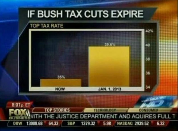
Before you read any further, take a look at the bar chart to your right, courtesy of Fox business channel. It purports to compare the current top tax rate, shown in the bar on the left, to the rate at the beginning of next year after Bush's tax cuts expire, shown in the bar on the right. Judging from the size of the bars, it appears that the top rate will increase to nearly six times the current rate.
However, if you look at the numbers on the chart, you'll see that the actual increase is only 4.6 percentage points from 35% to 39.6%. The chart greatly exaggerates the increase by cutting off the bottom part of the chart, so that all that we're seeing is the tops of the two bars. The only indication that the chart is truncated is the numerical scale on the right, which begins at 34% instead of at zero. This is the same trick that we saw previously in "Charts and Graphs" (see the Resource, below), and it's the oldest trick in the book, namely, Darrell Huff's How to Lie with Statistics, which devotes an entire chapter to it (see the Source, below). This is why Huff's book is considered a classic: the tricks it describes seem to never go out of style.
As was the case with the previous example, the numerical information in this chart is simple enough to present as is, and there isn't much point in using a bar chart unless it's to mislead.
Sources:
- Darrell Huff, How to Lie with Statistics (1954), Chapter 5: "The Gee-Whiz Graph"
- Naomi Robbins, "Another Misleading Graph of Romney's Tax Plan", Forbes, 8/4/2012
- Nathan Yau, "Fox News continues charting excellence", Flowing Data, 8/6/2012
Resource: Charts and Graphs, 6/4/2012
Update (9/18/2012): Naomi Robbins has a follow-up post discussing when, if ever, it's permissible to cut off the lower part of a graph. I have a few comments in response, so you might want to read her post before continuing.
Robbins claims that Darrell Huff, author of How to Lie with Statistics, thought that one should never cut off the lower part of a graph. I don't see where in Chapter 5 of his book Huff writes this, though he never says that it's okay sometimes to cut off the bottom, either. In any case, by calling the above bar chart a "gee-whiz graph" I don't mean to suggest that it's never appropriate to truncate a graph, just that it was misleading to do so in this particular case. Mainly, I wanted to point the reader to the relevant chapter of Huff's book where he discusses this and gives examples. While I agree with Robbins to never say "never", I think that Huff makes a good case that truncating even line graphs risks misleading people, since it can make a small change appear larger (p. 62). Here's Robbins' statement of her position:
My position is that whether zero needs to be included on graphs in which we judge position depends on the audience. For educated audiences who can be expected to read tick labels, zero is not needed. Some graphs for the general public might be misinterpreted without zero. Not including zero in the baseline is one way to exaggerate a trend for those who don�t read labels carefully.
That sounds right to me.
Source: Naomi Robbins, "Must Zero Be Included on Scales of Graphs? Another Look at Fox News' Graph and Huff's Gee-Whiz Graph", Forbes, 8/28/2012

August 3rd, 2012 (Permalink)
Check it Out?
The Susan G. Komen breast cancer charity has come under deserved criticism for the ad shown here recommending that women get screened early for breast cancer. The problem is in the smallish print down at the bottom of the ad: "Early detection saves lives. The 5-year survival rate for breast cancer when caught early is 98%. When it's not? 23%."
However, 5-year survival rates are worthless as evidence for the value of early detection of any disease. Why? Such a rate refers to the percentage of patients still alive five years after diagnosis of the disease. But if a disease is diagnosed earlier, more patients will survive at least five years after diagnosis even if they die at the same time.
Here's an example: Suppose that Sue is diagnosed with an advanced case of disease D in 2016, then dies in 2019. So, Sue was not alive five years after diagnosis. In contrast, if Sue had been diagnosed at an earlier stage of the disease in 2013, she would have been alive five years after diagnosis and, thus, contributed to the higher survival rate for early diagnosis. Nonetheless, she didn't live a second longer with the early diagnosis than with the later one.
So, the 5-year survival rate may be inflated by patients such as Sue who don't live any longer despite an early diagnosis. Of course, this doesn't mean that some patients won't indeed benefit from early diagnosis, but others may in fact be harmed by it. There are always going to be some false positives, that is, people who are diagnosed with a disease but don't actually have it―especially when the diagnosis is an early one. The five-year survival rate can't distinguish between those who do and those who don't benefit from an early diagnosis.
Still, it may be a good idea for women―especially those over fifty―to get screened for breast cancer. It's just that this ad is a misleading argument for that conclusion.
Sources:
- Ryan Jaslow, "Susan G. Komen's emphasis on mammograms during breast cancer awareness month called into question", CBS News, 8/3/2012
- Sydney Lupkin, "Breast Cancer: Komen Oversells Mammograms, Doctors Say", ABC News, 8/2/2012
- Steven Woloshin & Lisa Schwartz, "How A Charity Oversells Mammography", BMJ August 2012 e5132 (PDF)
- Saundra Young, "Professors: Komen overstating benefits of mammograms", CNN Health, 8/3/2012
August 1st, 2012 (Permalink)
Olympic Logic Puzzle 2
In the Olympic logic puzzle solving event, five countries competed and three different countries won the gold, silver, and bronze medals. From the following information, determine which country won each medal.
- At most, one of India and Japan took a medal.
- Either Hungary went home without a medal or France got one.
- If India didn't win a medal then neither did Hungary.
- If France won a medal then so did Hungary.
- If India didn't win the gold medal then Japan won a medal.
- If France didn't win the bronze medal then Germany took home a medal.
- Gold medal: India
- Silver medal: Hungary
- Bronze medal: France
According to clue 2, either Hungary won no medals or France won one. Suppose that Hungary won none. Then, based on clue 4, France also failed to win a medal. Since that leaves only three of the five countries left, each of India, Japan, and Germany must have won a medal. However, from Clue 1, India and Japan can't both have won a medal. So, Hungary must have won a medal, after all.
If Hungary won a medal then, by clue 2, France also won one. Also, by clue 3, India must have won a medal. So, the three medal winners are: Hungary, France, and India. By clue 5, India won the gold medal, since Japan won no medals at all. By clue 6, France won the bronze, since Germany didn't win anything. Therefore, by a process of elimination, we can conclude that Hungary won the silver medal.
Resource: Olympic Logic Puzzle, 8/9/2008