WEBLOG
Previous Month | RSS/XML | Current | Next Month
October 31st, 2013 (Permalink)
The Puzzle of Cell 13
The warden was faced with a puzzle: the prison's new death row contained only twelve cells, but thirteen inmates needed to be housed there. Moreover, the prison was under a court order not to put more than one prisoner into each cell, so the problem seemed insoluble. How could he get thirteen men into twelve cells? He sat and thought and paced and thought and sat thinking some more. Finally, he had an idea.
The warden called the prison's attorney to ask whether it would be acceptable to put two prisoners in one cell temporarily; the lawyer answered that it would not violate the court order as long as the two were not kept in the same cell overnight. "What've you got in mind?" the lawyer asked, "there are no executions coming up that soon are there?"
"No, not for months," the warden answered.
"You're not thinking of moving one inmate from cell to cell, are you? That would violate the order."
"No, it's nothing like that."
The next day the new inmates arrived. The warden was handed a list of names, numbered one through thirteen. In front of him, there were twelve empty cells, numbered one through twelve. What was he to do?
Here's what the warden did: he put the thirteenth inmate temporarily into the first cell, then the first inmate into the same cell. Now, there were two men in one cell. The warden then put the third inmate into the second cell, the fourth inmate into the third cell, the fifth inmate into the fourth cell, and so on. Eventually, he ended up at the twelfth and last inmate, whom he put into the eleventh cell. Now, he was able to move the thirteenth inmate―whom he had put temporarily in the first cell with the first inmate―into the empty twelfth and last cell. Success!
Did the warden really manage to get thirteen men into twelve cells without doubling up? If not, what happened to the thirteenth man?
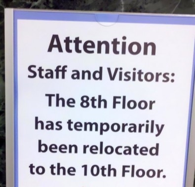
Source: "8th Floor Has Been Relocated", Funny Signs
October 30th, 2013 (Permalink)
A Hallowe'en Headline and a Reminder
Hospital body reactivated
-Dallas Times Herald
Source: Robert Goralski, compiler, Press Follies (1983)
- The Fallacy Files is reader-supported. Please consider visiting the Google Ads in the top right corner or at the bottom of the page, which help support the site. Thanks for your support!
October 24th, 2013 (Permalink)
Wikipedia Watch: Attack of the Sock Puppets
Wikipedia has a problem with sock puppets―or, more accurately, "sockpuppets", that is, one word instead of two. A "sockpuppet" is not a hand puppet made from an old sock, but "an online identity used for purposes of deception", to quote Wikipedia's article on the term. However, the real problem is not so much the false identities as what they are used for: at least one company is offering its services to create, write, and edit Wikipedia entries for businesses who wish to have a favorable page. As Will Oremus puts it:
…[T]he site�s volunteer editors had uncovered a major ring of �sockpuppets,� or bogus user accounts, that were allegedly editing articles on behalf of paying clients. That�s a serious problem, because Wikipedia articles are supposed to be neutral, not promotional. And they�re supposed to be written and edited by disinterested experts―not PR firms.
I suspect that this particular sockpuppet ring is just the tip of the iceberg. As long as Wikipedia can be edited by just anybody, I don't see how groups or individuals can be prevented from writing and editing their own entries, whether they do it themselves or hire someone else to do it. The very success and ubiquity of Wikipedia creates an incentive for people who are sensitive about publicity to do so.
Sources:
- Will Oremus, "Wikipedia�s 'Sockpuppet' Problem", Slate, 10/23/2013
- Simon Owens, "The battle to destroy Wikipedia's biggest sockpuppet army", The Daily Dot, 10/8/2013
Resources:
- A Contextomy and a Contradiction, 2/10/2005
- More Wikipedia Illogic, 4/30/2005
- Fact-Checking Wikipedia, 2/23/2012
- How to Hoax Wikipedia, 5/16/2012
Previous Wikipedia Watches: 6/30/2008, 10/22/2008, 1/25/2009, 3/22/2009, 7/21/2009, 1/9/2013
October 21st, 2013 (Permalink)
Low Confidence Interval
Now that American military involvement in Iraq is essentially over, we might hope to get an unpoliticized accounting of the effects of the war, including civilian casualties. Slate has a report about a new study using a similar methodology to the previous Lancet studies:
The new article builds on a controversial 2006 study published in the Lancet which estimated that 655,000 Iraqis had been killed as a result of the war at that time. While it garnered quite a bit of attention at the time, critics, including Slate�s Fred Kaplan, criticized its methodology.
This is incorrect in that there were two studies published in The Lancet, one in 2004 and another in 2006, and Kaplan criticized the first. Moreover, Slate doesn't mention that Kaplan's main criticism of the first Lancet study was that its confidence interval was so wide as to be uninformative. As far as I know, Kaplan did not comment on the second study, which had a much narrower confidence interval―for additional history and criticism of these studies, see the Resource, below, and its links.
Apparently, the current study suffers from the same problem as the first one:
…[T]hat actual estimate in the paper―as opposed to the eye-popping �half a million� figure that�s been reported, is a pretty wide range. The authors estimate with 95 percent certainty that the war caused between 48,000 and 751,000 excess deaths. Given that range, the numbers don�t seem that far off of the figures from the Iraq Body Count or Wikileaks.
Tell me about it! I believe that range is consistent with every previous study, and that's what's wrong with it: it doesn't tell us anything new. Translated, what the study says is that more civilians died because of the war than would have died otherwise, but we have no idea how many. Thanks a lot!
I haven't read the study itself yet, and I'm not sure that I'll bother to do so since it doesn't seem worth it. However, I have emailed Slate about the error in Keating's article, but so far there has been no correction. Slate, like most media outlets, is quick to correct trivial errors such as misspellings, but seems to be reluctant to admit to more substantive mistakes.
Sources:
- Fred Kaplan, "100,000 Dead�or 8,000", Slate, 10/29/2004.
- Joshua Keating, "Half a Million Deaths is a Statistic", Slate, 10/18/2013. Update (1/7/2016): The error in this article described above is still uncorrected. Is this one of those "fake news" articles I've been hearing so much about?
Resource: Deep Voodoo, 2/4/2009
Update (10/22/2013): Here's a further point about this study, which isn't really a point about the study itself but about how it's being reported. Keating is to be commended for having reported the study's 95% confidence interval (CI) in his Slate article. However, though he calls it "a pretty wide range", he doesn't seem to fully appreciate its significance. In this he's like most reporters of public opinion polls, who usually report the CI in the form of a margin of error (MoE), but often don't seem to understand what that means.
In contrast, I've checked a number of other online reports of the study (see the Sources, below, for a selection), and I've yet to see a mention of the CI. As I've noted before, it seems to be an accepted practice of the American news media to report the MoE when reporting a poll, though sometimes it's relegated to the fine print at the end of the article. However, it appears to be uncommon for news reports of statistical studies to report the CI, so that the reporting of this study is not unusual.
Nonetheless, the size of the CI is an important piece of information for evaluating a statistical study, as this study so clearly indicates. Reporters of such studies should report CIs for exactly the same reasons that journalists who report on polls report MoEs. A poll is just a particular type of survey, and the CI is important information, not some kind of technical trivia.
Sources:
- "Iraq study estimates war-related deaths at 461,000", BBC, 10/16/2013
- "New study puts Iraq war death toll at 500,000", United Press International, 10/15/2013
- Joseph Brownstein, "Iraq war claimed half a million lives, study finds", Aljazeera America, 10/16/2013
- Courtney Subramanian, "New Study Estimates Nearly 500,000 Died in Iraq War", Time, 10/15/2013
Resource: How to Read a Poll
October 19th, 2013 (Permalink)
Charts & Graphs: "I see a little silhouette-o of a man"
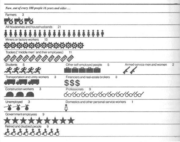
In the sixth entry in this series, prior to the pop quiz (see the Previous Entries, below), we looked at the type of pictograph in which a picture of a single object replaces a bar in a bar graph. Another type of pictograph uses a number of pictures of the same type of object to replace the bar. Probably the most common picture used in this type of pictograph is a little silhouette of a person; see, for instance, the second, fifth, and eighth lines of the example above. However, pictures of other types of object can be used, such as the little tractors, trucks, and glasses in lines one, six, and seven in the example. Commonly, each little picture will represent a certain number of the items pictured, so each little person might stand for ten or a hundred people, and a row of seven silhouettes would then stand for seventy or seven-hundred people, as the case may be.
In the example, each little picture represents one out of a hundred people, so that the pictograph provides percentage information. For this reason, there are a total of a hundred little pictures in the graph. The different types of picture represent different occupations, with a tractor representing a farmer, a briefcase standing for a self-employed person, and a silhouette of a skirted person a housewife―or househusband! Thus, the first line of the graph, which shows a row of three tractors, tells us that 3% of people sixteen years of age or older are farmers; the fifth line, showing five running figures, shows that 5% of the population are students, etc.
There's nothing inherently wrong with this type of pictograph, nor with any of the other types of chart and graph that we've looked at in this series, but this one's a dud. The primary problem with it is that the little pictures of different types vary in size; for instance, the little tractors are about twice as long as the housewives/husbands. As a result, it's difficult to compare the lengths of the rows of different professions; for example, the line of students and the row of trucks are almost the same length, despite the fact that the students represent 5% of the population whereas the transportation and utility workers are only 3%. In contrast, the row of government employees―represented by stars, for some reason―is longer than that of wheelchairs, representing the retired and disabled, even though both constitute the same percentage of the population. As a general rule, in this kind of pictograph the pictures representing different categories need to be the same size, so that relative sizes of the categories can be visually compared.
The difficulty of comparing the lengths of the rows is increased by the fact that the fifth through eighth rows of the chart include two or more categories side-by-side. Presumably, this was done to make the chart more compact, but it makes it even more difficult to visually compare the lengths of the categories. Of course, the chart includes the number of each category's percentage of the population, but it defeats the purpose of a graph to have to read numbers. If you're going to have to read numbers to compare the sizes of different categories, you might as well have a table instead of a pictograph.
Source: Lucy Horwitz & Lou Ferleger, Statistics for Social Change (1980), p. 58. The graph is from The New York Times, 7/4/1976―bicentennial day!
Previous entries in this series:
- The Gee-Whiz Line Graph, 3/21/2013
- The Gee-Whiz Bar Graph, 4/4/2013
- Three-Dimensional Pie, 5/5/2013
- The 3D Bar Chart, Part 1, 6/3/2013
- The 3D Bar Chart, Part 2, 7/11/2013
- The One-Dimensional Pictograph, 8/1/2013
- A Charts & Graphs Pop Quiz, 9/15/2013
October 16th, 2013 (Permalink)
Check 'Em Out
- (10/18/2013) Brian Dunning has another interesting podcast on how to use Socratic questioning for such purposes as clarification, discovering assumptions, and challenging premisses and inferences. Read―or listen―to the whole thing.
Source: Dunning, B., "Asking the Socratic Questions", Skeptoid Podcast, 10/15/2013
- Emil Karlsson, at the Debunking Denialism weblog, has a useful post on how to critically examine claims made in the news media about research results. He's done good work along these lines, but you can't expect him to cover every scientific claim reported. We've seen many examples here of misleading reporting about science, so it's a useful skill to know how to check things out yourself before changing your behavior because of something you've seen in the media. In addition to giving general advice on how to research such claims, there's a case study showing how to apply the principles. I expect that doing this sort of research on a randomly-selected science news article would be a revealing critical thinking exercise. The English grammar is a little wonky―I guess that Karlsson is not a native speaker―but read the whole thing.
Source: Emil Karlsson, "Investigative Skepticism Versus the Mass Media", Debunking Denialism, 10/13/2013

October 14th, 2013 (Permalink)
New Book:
Philosophy of Pseudoscience
In the South Seas there is a cargo cult of people. During the war they saw airplanes with lots of good materials, and they want the same thing to happen now. So they've arranged to make things like runways, to put fires along the sides of the runways, to make a wooden hut for a man to sit in, with two wooden pieces on his head like headphones and bars of bamboo sticking out like antennas―he's the controller―and they wait for the airplanes to land. They're doing everything right. The form is perfect. It looks exactly the way it looked before. But it doesn't work. No airplanes land. So I call these things cargo cult science, because they follow all the apparent precepts and forms of scientific investigation, but they're missing something essential, because the planes don't land.―Richard Feynman
Philosophers Massimo Pigliucci and Maarten Boudry (P&B) have a book out called Philosophy of Pseudoscience, together with an interesting article in The New York Times on "the demarcation problem" and why it's important (see Source 4, below). The problem consists in how to delineate the difference between science and non-science or, more specifically, pseudo-science:
Philosophers nowadays recognize that there is no sharp line dividing sense from nonsense, and moreover that doctrines starting out in one camp may over time evolve into the other. For example, alchemy was a (somewhat) legitimate science in the times of Newton and Boyle, but it is now firmly pseudoscientific (movements in the opposite direction, from full-blown pseudoscience to genuine science, are notably rare).
I think that P&B make a good case, in their second and third reasons, for the practical importance of demarcating science from pseudoscience. However, I'm not so sure that the "problem" is of any great philosophical importance, and their reason is rather unspecific: "Demarcation is crucial to our pursuit of knowledge; its issues go to the core of debates on epistemology and of the nature of truth and discovery."
In my view, defining "pseudoscience" is easy but not very revealing: pseudoscience is that type of non-science that masquerades as science (this is over-simplified; see Source 3 for further refinement). It's "cargo cult" science, to use Feynman's phrase, which goes through the motions of science but "the planes don't land".
P&B's discussion of qi puzzles me: it's old enough to be a pre-scientific idea, and thus a superstitious or religious concept rather than a pseudoscientific one, though recent claims made about it may be pseudoscientific to the extent that they treat it as though it were scientific. Apparently, they chose this example in answer to an earlier article by philosopher Stephen Asma on Chinese folk medicine (see Source 1, below). On one hand, they say that qi is an unscientific concept because it's untestable:
[Qi] sounds scientific, because it uses arcane jargon that gives the impression of articulating explanatory principles. But there is no way to test the existence of Qi and associated meridians, or to establish a viable research program based on those concepts, for the simple reason that talk of Qi and meridians only looks substantive, but it isn�t even in the ballpark of an empirically verifiable theory.
On the other hand, it seems that qi has been tested and flunked:
In terms of empirical results, there are strong indications that acupuncture is effective for reducing chronic pain and nausea, but sham therapy, where needles are applied at random places, or are not even pierced through the skin, turn out to be equally effective…, thus seriously undermining talk of meridians and Qi lines.
If qi is an untestable, unempirical notion, I don't see how the results of tests of acupuncture could undermine talk of it. If acupuncture "works" no matter where you put the needles, then the hypothesis of qi and meridians does no explanatory work and falls by Occam's razor.
I wonder if qi isn't like astrology, which is a paradigm case of a pseudoscience. The problem with astrology is not so much that it makes untestable claims, but that its claims have been tested and found false. Of course, astrologers engage in "the bad habit of creative fudging and finagling with empirical data [that] ultimately makes a theory impervious to refutation", as P&B put it. However, this can be done with any pet theory, including ones that are clearly empirical. For instance, such familiar theories as those about bigfoot, the Loch Ness monster, and UFOs at least start out making clearly empirical claims. It's only later, in the face of refutation, that all the "fudging and finagling" reduces them to vacuity.
Of course, I agree with P&B that pseudoscience is harmful:
Indulging in a bit of pseudoscience in some instances may be relatively innocuous, but the problem is that doing so lowers your defenses against more dangerous delusions that are based on similar confusions and fallacies. For instance, you may expose yourself and your loved ones to harm because your pseudoscientific proclivities lead you to accept notions that have been scientifically disproved, like the increasingly (and worryingly) popular idea that vaccines cause autism.
Sources:
- Stephen T. Asma, "The Enigma of Chinese Medicine", The New York Times, 9/28/2013
- Richard Feynman, "Cargo Cult Science" (1974)
- Sven Ove Hansson, "Science and Pseudo-Science" Stanford Encyclopedia of Philosophy, 9/3/2008
- Massimo Pigliucci & Maarten Boudry, "The Dangers of Pseudoscience", The New York Times, 10/10/2013
October 1st, 2013 (Permalink)
Untie the Nots, Part 6
CNN correspondent Dana Bash was quoted in a news article (see the Source, below) saying the following:
I've not talked to anybody here who doesn't think it's a very, very big possibility, even Republicans, that the government won't shut down—even for a short time.
What is she saying? There are too many negations in that sentence. Did the people she talked to think that the federal government would or wouldn't shut down? Can you reword Bash's statement without changing its meaning so that it's easier to understand? Give it a try, then click the link below to untie the nots:
Source: Cary Docter, "Defiant House delays Obamacare; government shutdown looms" Fox 6 Now, 9/29/2013
Previous "Untie the Nots": Part 1, Part 2, Part 3, Part 4, Part 5
Solution to the Puzzle of Cell 13: Of course, the warden didn't really succeed in putting thirteen men in twelve cells without doubling up―that's impossible! The puzzle is worded in a deceptive way: if the warden really followed the procedure as described in the puzzle, he would be left with one man not in any cell: the second inmate. The deceptive part of the description occurs in the passage:
He put the thirteenth inmate temporarily into the first cell, then the first inmate into the same cell. Now, there were two men in one cell. The warden then put the third inmate into the second cell….
Where did the second inmate go? The two men in the first cell are the first and the thirteenth inmates, then we skip to the third through twelfth inmate, who are put in the second through eleventh cells. Finally, the warden moves the thirteenth inmate into the twelfth cell, so that there is only one man in each cell, but the second inmate is left standing there!
The puzzle's deceptiveness comes from confusing two different types of number: ordinal and cardinal. Ordinal numbers are used to designate the position of something in a list, whereas cardinal numbers are used for counting how many members there are in a set. Both types of number occur in the puzzle: there are twelve cells and thirteen prisoners―cardinal numbers; and each cell is numbered first through twelfth and the prisoners numbered first through thirteenth―ordinal numbers. However, the deceptive passage goes from talking about cardinal numbers to ordinal numbers:
Now, there were two men in one cell. The warden then put the third inmate into the second cell….
"Two" is a cardinal number, indicating how many men are in the first cell; whereas "third" is an ordinal number designating the third inmate on the list of prisoners. If you don't notice this transition, you may be left with the impression that the second prisoner is in the first cell. However, the second inmate is never accounted for, which is how it seems that the warden put thirteen men in twelve cells.
Source: V. M. Bradis, V. L. Minkovskii & A. K. Kharcheva, Lapses in Mathematical Reasoning (1999). The puzzle is based on an example on page 38.
The Nots Untied: Before we begin to untie the nots, part of the difficulty with understanding this sentence comes from its complexity. Let's simplify it using a stepwise procedure. There are a couple of provisos that could have been more clearly stated separately:
- The phrase "even Republicans" must refer back to the beginning of the sentence "I've not talked to anybody"―even Republicans…. Presumably, Bash got to the middle of the sentence, suddenly thought of adding that the "anybody" she was talking about included Republicans, and so dropped that phrase into the midst of the sentence where it doesn't belong. As a first step, let's remove it and then we could add it back in later as a separate sentence if necessary:
I've not talked to anybody here who doesn't think it's a very, very big possibility that the government won't shut down—even for a short time.
- The phrase "even for a short time" at the end is at least attached to the part of the sentence it qualifies, namely, the possibility of a government shutdown. However, this is a qualification that could be stated separately, so let's take it out:
I've not talked to anybody here who doesn't think it's a very, very big possibility that the government won't shut down.
Now we can work on the negations. There are three in this sentence: a "not", and two negative contractions―"doesn't" and "won't". We can't get rid of all of these, since there's an odd number and negations cancel out in pairs. So, the best that we can hope to do is to get down to one. The negation that we won't be able to get rid of is the last one because it's contained within a component statement: "It's a very, very big possibility that the government won't shut down." As Geoff Pullum points out (see the Source, below), the structure of the whole sentence is "I've not talked to anybody here who doesn't think p", where "p" is the component sentence.
So, the negations that we need to remove are the first two, but we can't just take them out of the initial phrase―rather, we need to find a positive way to restate it. If Bash did not talk to anybody who didn't think p, then everybody she talked to thought p. Therefore, we can restate the whole sentence as follows:
Everybody I've talked to here thinks it's a very, very big possibility that the government won't shut down.
Now, that's easy to understand. However, as Pullum points out, it's probably not what Bash meant to say, as the context indicates that she must not have intended that last negation. Presumably, confused by the complexity of her own statement, she added it by mistake.
Source: Geoff Pullum, "CNN: Not Anybody Who Doesn't Think It Won't. Huh?" Slate, 9/29/2013
Technical Appendix (10/2/2013): For those familiar with formal logic, here's an analysis of the logical form of the sentence. We don't need to get into the guts of p, so let's treat it as an atomic sentence. Before fully symbolizing it, we can rephrase the sentence into a sort of logical English as: "It is not the case that there is a person here that I have talked to who does not think p." For simplicity's sake, let's restrict the universe of discourse to people here. Then, we can symbolize it as follows, where "I" is the speaker, and the predicates are self-explanatory:
∼∃x[Talked(I,x) & ∼Thinks(x,p)]
Now, in order to remove the negations, we need to bring them together. There are many ways to do this, but here's one. Using the quantifier-negation rules, we know that a negated existential quantifier is equivalent to a universal quantifier followed by a negation:
∀x∼[Talked(I,x) & ∼Thinks(x,p)]
From propositional logic, we know that a statement of the form ∼(p & ∼q) is equivalent to (p → q), which gives us:
∀x[Talked(I,x) → Thinks(x,p)]
So, the negations are gone and the result says in English: "Everyone here I talked to thinks p".
Resource: Morton L. Schagrin, The Language of Logic: A Programed Text (1968)